Living Room Wall Art Scale Calculator
Stop guessing. Use the "Two-Thirds Rule" and museum standards to ensure your art looks expensive, not accidental.
Your Luxury Art Strategy
Recommended Art Span:
-- inches
(Approx. 2/3 of furniture width)
Art Center Height:
-- inches
(From floor to center of frame)
Bottom of Frame:
-- inches
(From floor)
Gap Above Furniture:
-- inches
(Ideal is 6-8")
You walk into a friend's house, and something just feels... right. It’s not that they bought the most expensive sofa or installed marble floors everywhere. It’s the vibe. The space feels curated, intentional, and yes, expensive. You wonder if it’s the lighting, the furniture layout, or maybe just good luck with natural light. But here is the secret most people miss: Wall Art is often the single biggest lever you can pull to elevate a room from "basic" to "boutique."
I’ve spent years helping clients in Vancouver transform their spaces without breaking the bank. The truth? Luxury isn't about spending more; it's about spending smarter. A $50 print framed correctly can outshine a $500 canvas hung haphazardly. If you want your living room to whisper sophistication rather than shout budget, you need to rethink how you decorate your walls.
The Psychology of Perceived Value
Why does some art make a room feel cheap while other pieces feel luxurious? It comes down to visual weight and intentionality. Cheap-looking rooms often suffer from "visual clutter"-too many small frames, mismatched styles, or art hung at eye level like a gallery for ants. Expensive rooms use negative space. They let the art breathe.
When you hang art, you are directing the eye. High-end interiors use art to create focal points that anchor the furniture. If your couch is floating in the middle of the room, a large piece of art behind it grounds the seating area. Without it, the furniture looks lost. This principle applies whether you have a studio apartment in downtown Vancouver or a sprawling suburban home.
Scale Matters More Than Style
Here is the number one mistake I see: buying art that is too small for the wall. If you have a ten-foot wall above a sofa, hanging a single 16x20 inch print makes the wall look empty and the room look cramped. It signals that you didn’t commit to the space.
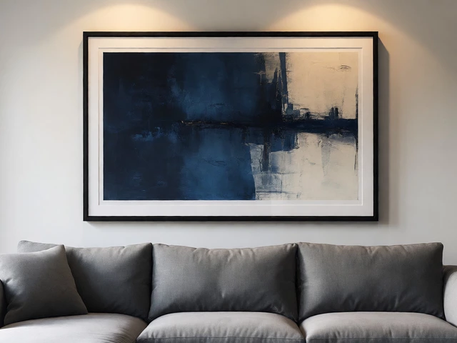
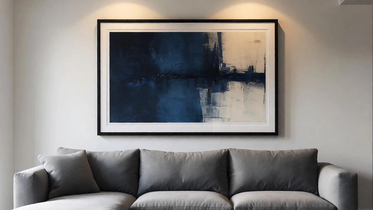
To fix this, follow the two-thirds rule. Your artwork (or group of artworks) should span roughly two-thirds the width of the furniture below it. For a standard three-seater sofa, which is usually around 84 inches wide, you need art spanning about 56 inches. That might mean one massive statement piece or a carefully curated triptych. Large-scale art implies confidence. Small, scattered art implies hesitation.
| Furniture Type | Avg. Width (Inches) | Recommended Art Span (Inches) | Suggested Configuration |
|---|---|---|---|
| Standard Sofa | 72-84 | 48-56 | One large horizontal piece or Triptych |
| Sectional (L-Shape) | 90-110 | 60-73 | Large vertical piece on main wall |
| Armchair Pair | 60-70 | 40-46 | Single medium square piece |
| Console Table | 40-50 | 26-33 | Vertical portrait orientation |
Framing Is Not an Afterthought
You can buy a digital download for $10, but if you put it in a flimsy plastic frame from a big-box store, it will look like a dorm room decoration. Framing adds depth, shadow, and professionalism. It separates the art from the wall, creating a layer of luxury.
Go local. Find a custom framer in your city. Yes, it costs more upfront, but the difference is night and day. Ask for a mat (the white border inside the frame). A mat creates breathing room around the image, making even a simple sketch look museum-quality. For modern spaces, thin black metal frames work wonders. For traditional homes, wider wood frames with a slight bevel add warmth. Avoid ornate, gold-leaf frames unless you are going for a very specific maximalist look-they can easily tip into "dated" territory.
Hanging Height: Stop Using Eye Level
Museums don’t hang art at average human eye level for a reason. They hang it so it aligns with the furniture. When you hang art at "eye level" (usually 57-60 inches from the floor to the center), you disconnect it from the rest of the room. It floats aimlessly.
Instead, hang your art 6 to 8 inches above the top of your sofa back or console table. This creates a cohesive unit. The art becomes part of the furniture grouping, not a separate entity. If you have high ceilings, do not stretch the gap to 12 inches. Keep it tight. Tight gaps signal precision and care. Loose gaps signal laziness.
Curating a Cohesive Palette
Random art collections look chaotic. Expensive rooms look collected over time, but there is always a thread connecting them. Usually, that thread is color. Pick two or three colors present in your rug, curtains, or upholstery, and ensure every piece of art incorporates at least one of those hues.
This doesn’t mean everything has to match perfectly. In fact, perfect matching looks sterile. Instead, aim for harmony. If your living room features navy blue and cream tones, choose art that includes deep blues, soft whites, or perhaps a contrasting accent like mustard yellow. This repetition of color guides the eye smoothly across the room, creating a sense of flow and intentionality that reads as "designer."
Mixing Mediums for Depth
Flat prints are fine, but mixing mediums adds texture. Texture catches light differently throughout the day, keeping the room dynamic. Consider incorporating:
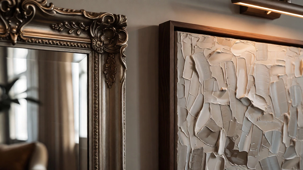
- Textured Canvas: Impasto paintings or thick-weave canvases add physical depth.
- Mirrors: An antique mirror acts as art while bouncing light, making the room feel larger and brighter.
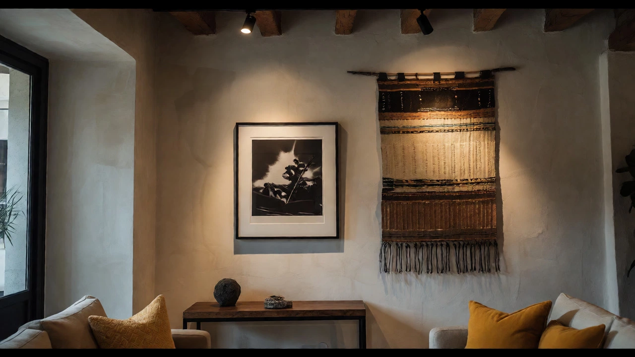
- Photography: Black and white photography adds a timeless, editorial feel.
- Textiles: Tapestries or woven wall hangings soften acoustics and add warmth.
Don’t worry about having all these at once. Start with one non-traditional piece. Maybe swap a print for a vintage mirror. Notice how the light changes in the room. This experimentation shows confidence, another hallmark of expensive design.
The Power of Negative Space
Amateurs fill every blank wall. Professionals leave space. If you have a gallery wall, ensure there is consistent spacing between frames. Uneven spacing looks messy. Use painter’s tape to mark out your layout before hammering nails. Step back. Does it feel crowded? Remove a piece. Less is almost always more when aiming for luxury.
Negative space allows the viewer’s eye to rest. It highlights the quality of what remains. If you have a stunning large piece, give it room. Don’t crowd it with smaller trinkets nearby. Let it command attention.
Lighting Your Art
You can have the best art in the world, but if it’s poorly lit, it won’t register. Recessed ceiling lights often cast harsh shadows directly onto the art, washing out details. To fix this, consider picture lights mounted directly above the frame, or adjustable track lighting aimed specifically at the artwork.
Warm light bulbs (2700K-3000K) generally flatter art better than cool daylight bulbs. They enhance warm tones in paintings and create a cozy, inviting atmosphere. If you can’t install new wiring, battery-operated LED puck lights inside frames or clip-on picture lights are affordable alternatives that still provide that "spotlight" effect.
Investing in Originality
While prints are great, original art carries a unique energy. You don’t need to buy from famous artists. Local markets, university art departments, and online platforms like Etsy offer incredible talent at accessible prices. Buying original work supports a creator and gives you a piece no one else has.
Original art often has subtle imperfections-brushstroke variations, paper texture-that mass-produced prints lack. These nuances add authenticity. People perceive authenticity as value. Knowing the story behind a piece (where you found it, who made it) also adds emotional value, which translates to perceived monetary value.
Final Checklist for a Luxe Look
Before you finalize your living room update, run through this quick audit:
- Size Check: Is the art at least two-thirds the width of the furniture below it?
- Height Check: Is the bottom of the frame 6-8 inches above the furniture?
- Frame Quality: Is the frame sturdy, clean, and appropriately matted?
- Color Harmony: Do the art colors echo elements elsewhere in the room?
- Spacing: Are gaps between multiple pieces consistent?
- Lighting: Is the art illuminated by a dedicated light source?
Making a living room look expensive isn’t about throwing money at the problem. It’s about editing, scaling, and detailing. By focusing on wall art, you control the visual narrative of your space. Start with one large piece, frame it well, and hang it with precision. You’ll be surprised how quickly the rest of the room starts to feel like it belongs in a magazine.
How far apart should frames be on a gallery wall?
Consistency is key. For a cohesive look, keep the space between frames uniform, typically between 2 to 4 inches. Smaller gaps (2 inches) create a tighter, more formal grid, while slightly larger gaps (4 inches) feel more relaxed. Avoid uneven spacing, as it disrupts the visual rhythm and makes the arrangement look accidental rather than designed.
Should I match my art frames to my furniture?
Not necessarily. Matching everything exactly can look dated and overly coordinated. Instead, aim for complementary finishes. If your furniture has dark walnut legs, try frames in a similar wood tone or a contrasting black metal. Mixing metals (like brass and silver) is acceptable if done intentionally, but sticking to one metal type per room simplifies the process and ensures harmony.
What is the best height to hang art on a bare wall?
On a bare wall without furniture underneath, the center of the artwork should be at 57 to 60 inches from the floor. This is the standard museum height, based on average human eye level. However, if the ceiling is particularly high (over 9 feet), you may raise this slightly to maintain proportion, but never go higher than 65 inches, or the art will feel disconnected from the living space.
Can I mix different sizes of art in one arrangement?
Yes, but alignment matters. Align either the tops, bottoms, or centers of the pieces. A common technique is to align the bottoms of varying heights, which creates a stable base line. Alternatively, aligning centers works well for symmetrical arrangements. Random placement of mixed sizes usually results in visual chaos unless carefully planned with paper templates first.
Is black and white art outdated?
No, black and white art is timeless. It serves as a neutral foundation that allows colorful furniture or rugs to pop. It adds graphic contrast and sophistication. Many high-end designers use monochrome art to prevent a room from feeling overwhelming. Just ensure the black is truly deep and the white is crisp, avoiding faded or yellowed prints which can look neglected.