As we step into 2024, the world of furniture is alive with a stunning array of colors that are setting the stage for stylish and inviting homes. Choosing the right furniture colors can dramatically alter the look and feel of any room, and this year, the palette available is more dynamic than ever. Whether you lean towards the natural hues of the earth or the cool refreshing shades of the ocean, there is something for everyone looking to adorn their spaces with vibrant life.
Embracing the latest color trends in furniture can be both a fun adventure and an enlightening one. This year, earthy tones, striking blues, and gentle pastels are making waves in showrooms and living rooms alike. These colors not only add character and depth but also reflect a broader movement towards comfort and sustainability. With a careful selection, your pieces can harmonize with the setting in unique and beautiful ways, showing off your individual taste.
Warm Earthy Tones
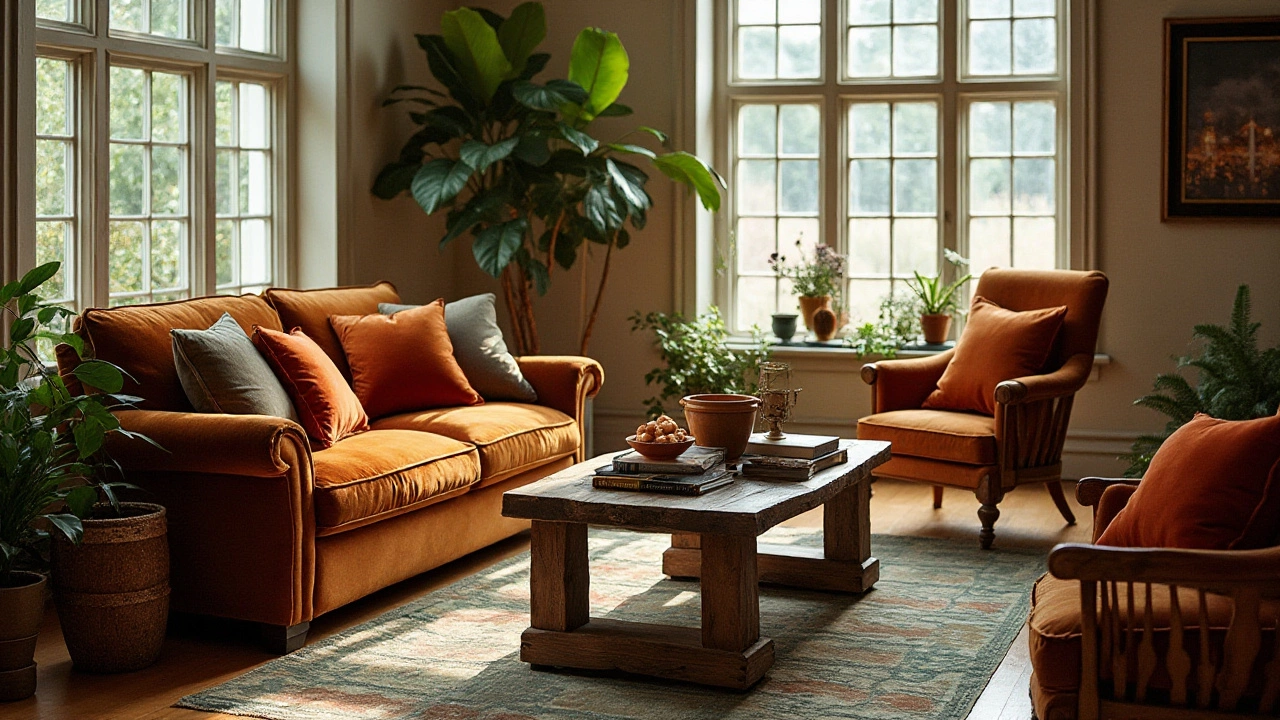
In 2024, the trend of embracing nature continues as furniture trends tilt towards warm earthy tones that evoke a sense of comfort and serenity. Earthy colors, which include shades like terracotta, rich sienna, and deep ochre, add a grounded and rustic feel to any room, making spaces feel both comfortable and inviting. These hues mirror the subtle beauty of the natural world and foster a connection to the outdoors that is both timeless and contemporary. It's no surprise that these colors are at the forefront of home decor this year, as they offer a simple way to create a truly welcoming atmosphere.
The appeal of warm earthy tones lies in their versatility and inherent warmth. Whether used for plush sofas, elegant armchairs, or sturdy wooden tables, these colors can transform a room into a cozy retreat. Within this palette, terracotta stands out with its soft, muted red undertones. Often associated with Mediterranean aesthetics, it's a color that embodies the raw beauty of clay and brings warmth into the home without being overpowering. Similarly, deep ochre, reminiscent of golden fields, adds an optimistic glow to interiors, perfect for brightening spaces.
When implemented effectively, these hues serve to balance more vibrant colors and act as a neutral backdrop that complements various styles and textures. A room decked with furniture in earthy tones provides a harmonious environment that encourages relaxation, aligning perfectly with the growing trend towards wellness-focused interiors. Notably, famed interior designer Kelly Wearstler emphasizes the importance of using such colors to create spaces that 'inspire calmness and creativity'.
Earthy tones tell a story of heritage and sustainability. They remind us of the world's beauty and the cycle of nature that is grounding and soothing. — Kelly Wearstler
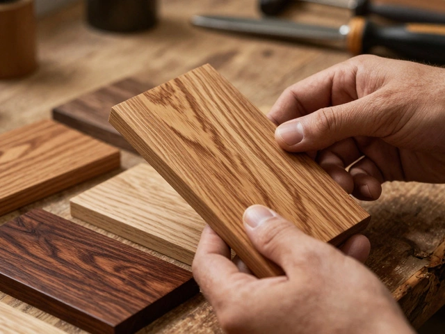
For those interested in adding earthy tones to their spaces, the process can be both accessible and exciting. It's worth considering different combinations of materials that work well with these colors, such as pairing a sienna-colored leather couch with a soft beige wool throw, or incorporating wooden elements that highlight these tones' natural dimension. Utilizing varied textures can enhance the visual depth and make the room feel more dynamic.
Understanding how light interacts with these colors throughout the day is also crucial. Earthy tones often change character, appearing more subdued or radiant as natural sunlight moves through a room. This fluid quality makes them perfect for large pieces that anchor a room, as well as for smaller decorative elements like vases or cushions that are easy to switch up when refreshing the look becomes necessary.
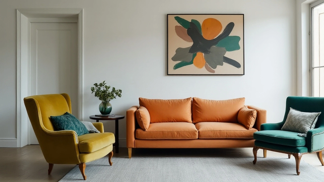
Bold and Bright Blues
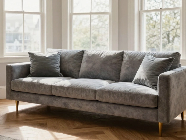
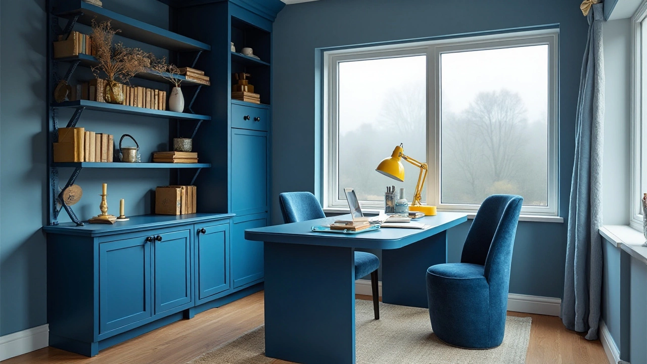
The allure of bold and bright blues in furniture is undeniably fascinating, capturing both the calm of serene waters and the vibrancy of clear skies. In 2024, these shades are making a strong statement in the interior design world, echoing a need for refreshing and revitalizing living spaces. Blues are incredibly versatile, offering possibilities that range from creating a cool tranquil atmosphere to bringing a lively and energetic vibe to a room. This year, designers are exploring everything from deep navy and cobalt to electric azure and royal tones, each bringing its unique personality to a piece of furniture.
One cannot underestimate the psychological impact these bold and bright blue hues have in a space. Such colors are known to stimulate thoughts of peace and tranquility while also inspiring creativity and productivity. This makes them an excellent choice for both living rooms and workspaces. In modern apartments and homes, bold blue pieces can serve as accent pieces, catching the eye and drawing attention while harmoniously blending with neutral surroundings like whites, grays, and beiges. Conversely, they can also be part of a more colorful palette, adding depth and a sense of cohesion to eclectic interiors.
According to some interior design experts, using blue in your decor can significantly influence the mood of a room. As Helen Baxter, a leading interior designer, puts it,
"Blue is not just a color—it's a mindset. It can change how individuals feel within a space, enhancing calming thoughts and offering a sense of stability in a chaotic world."Whether it's a plush, blue velvet sofa making a statement in your living room or a set of azure dining chairs that uplift your meal settings, this color offers an array of choices that bind functionality with aesthetic allure.
To integrate bold and bright blues effectively, consider the element of contrast. When paired with warm wood tones, blue furniture items pop spectacularly, providing a balance of warmth and coolness that feels natural and inviting. Similarly, blue complements metallic finishes like brass and copper, amplifying modern and chic vibes. Lighting also plays a crucial role in enhancing blue shades. Natural light reveals subtle undertones, while artificial lighting can give the furniture a striking evening glow. For those looking for data-backed colors, studies indicate that blue environments often improve focus and foster a positive work attitude, making it a strategic choice for home offices.
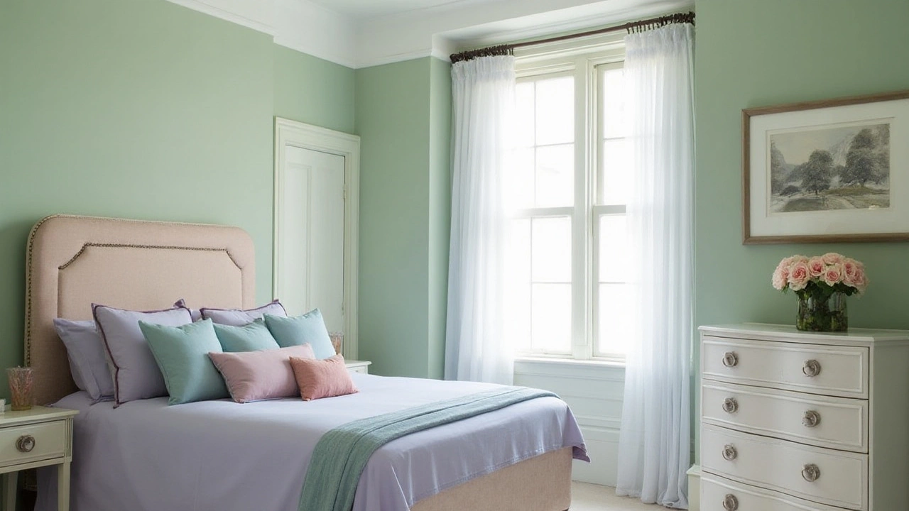
Soothing Pastels
Pastel colors have an undeniable ability to transform spaces with their gentle allure and calming presence. In 2024, these color trends are making significant waves in the world of furniture and interior design. Pastels offer an elegant breath of fresh air into any room they enter, introducing elements of tranquility and subtlety that more vibrant hues could potentially overshadow. By employing pastel shades, you can create a serene environment that enables a seamless blend between modern aesthetics and peaceful settings. Pastels are particularly lovely for spaces where relaxation is paramount, such as living rooms, bedrooms, and even home offices.
Pastels like mint green, blush pink, and soft lavender have risen in popularity this year because they harmonize with both classic and contemporary designs. They provide an excellent backdrop for pieces of furniture that demand more attention or have intricate details that deserve to be highlighted. What makes pastels unique in the realm of home decor is their versatility. These colors can complement natural materials like wood and leather, creating a balanced look that feels organic and inviting. For those wary of too much color, pastels offer an approachable way to break into the use of color within interiors.
Design experts commend the adaptability of pastels in a multitude of spaces. "Pastels are unmatched in their ability to convey calmness and sophistication," says Sarah Richardson, a renowned interior designer.
They bring a soothing touch to spaces dominated by neutral or bold colors, effectively adding layers of depth and character.Incorporating pastels doesn't entail transforming your entire space. Small touches such as an accent chair, decorative pillows, or curtains can introduce these graceful tones in measured proportions. This allows homeowners to experiment without the commitment of an entire overhaul.
In terms of practical application, pastels also shine in multifunctional areas like dining rooms or playrooms. For instance, a dining room set in a soft pastel blue can evoke a sense of spaciousness and cleanliness, encouraging long dinners filled with delightful conversation. Meanwhile, introducing pastels in children's play areas can foster a nurturing and creative environment. It's said that such gentle colors are known to aid concentration and relaxation, a claim often supported by educators and child psychologists. This year, we are witnessing a shift where more people are opting to select pastel-infused furnishings that resonate with the calming yet playful essence they represent.
Using Colors in Your Space
Incorporating trending color trends 2024 into your home can reimagine your space in a myriad of enchanting ways. The key to a harmonious and visually striking interior lies in carefully selecting colors that not only reflect personal taste but also enhance the architectural elements and existing furnishings. A balanced approach involves considering the size of the room, the natural light it receives, and the function it serves. A small room can feel larger with the right bold hues, while oversized spaces may benefit from the warmth of earthy tones that create a sense of coziness.
Experts often advise beginning with a neutral base when redesigning a space, especially when using vibrant accents. Neutrals like soft whites and grays provide a perfect canvas to layer on bolder shades without overwhelming the senses. Introducing bold and bright blues in the form of accent chairs or drapery can inject energy and personality into a room. A glossy midnight couch can become the focal point, inviting admiration and conversation. Meanwhile, bright azure accents, like cushion covers or vases, add splashes of vitality without altering the room's overall tranquility.
Considering the psychology of colors can be an insightful way to select the perfect palette for different rooms. Living rooms and dining areas might benefit from calming, soothing pastels such as soft lavender or pale sage, which can promote relaxation and wellbeing. These gentle tones create a warm and inviting atmosphere. Bedrooms, on the other hand, can be peaceful sanctuaries with tranquil blues or greens, which are known to help reduce stress and encourage restful sleep. Add complementary textures and materials—like natural wood or wool—to enhance the comforting atmosphere.
"The best color in the whole world is the one that looks good on you." – Coco Chanel
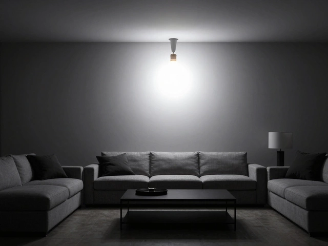
Lighting also plays an indispensable role in how colors appear. Natural daylight reveals the truest form of colors, while artificial lighting can dramatically alter their effect. A vibrant green sofa might appear muted in dim light compared to the bright daylight. When choosing colors under artificial lights, pay attention to warm bulbs enhancing warmer tones and cool bulbs that are more suited for cooler hues. Smart lighting systems that allow bulb color changes can offer the flexibility to experiment with different moods and settings.
| Room | Suggested Color | Advantages |
|---|---|---|
| Living Room | Earthy Tones | Creates warmth and comfort |
| Bedroom | Pastel Blues | Promotes relaxation |
| Kitchen | Bright Yellow | Stimulates appetite and energy |
Coordinating home décor with the latest color trends involves experimenting and blending until the right ambiance is achieved. Try painting a single wall as a feature piece and accessorize with matching décor items to tie the room together. Don't shy away from unexpected pairings—sometimes opposites do attract and blend well, like the plush texture of velvet with the ruggedness of leather in a hot mustard hue. The trending furniture trends offer plenty of room for personal expression that can easily reflect who you are through your sanctuary.