Curtain Color Strategy Visualizer
Room Settings
Design Insight
Adjust the settings above and click "Apply & Analyze" to see how your choices impact the room's perception.
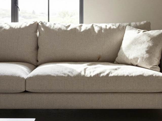
You stand in the middle of your living room, holding a swatch of fabric that looks perfect on its own. But does it belong there? This is the classic interior design dilemma: should your curtains match the wall color or the furniture? It’s not just about picking a pretty pattern; it’s about how you want people to feel when they walk into the room. Get this wrong, and your space might feel disjointed or cramped. Get it right, and you’ve instantly elevated the entire aesthetic without buying a single new piece of art.
The short answer? Neither rule is absolute. In fact, sticking rigidly to one often leads to boring or unbalanced rooms. The real secret lies in understanding contrast, texture, and the specific role each element plays in your home’s visual hierarchy. Let’s break down exactly how to decide which path to take for your windows.
Key Takeaways
- Match walls to make ceilings look higher and rooms feel larger (the "invisible" trick).
- Match furniture to create a cohesive, grounded look, but watch out for monotony.
- Use neutral tones like beige, grey, or white as a safe bridge between bold walls and eclectic furniture.
- Consider texture over color; linen, velvet, and sheer fabrics change how light interacts with your space.
- Test samples in natural light before committing, as colors shift dramatically from morning to evening.
Why Matching Walls Creates Space
If your primary goal is to make a small room feel bigger, matching your curtains to wall color is your best bet. This technique, often called "blending," tricks the eye into seeing the window treatment as part of the architecture rather than a separate object. When the fabric disappears into the background, the vertical lines of the drapes draw the eye upward, making ceilings appear taller.
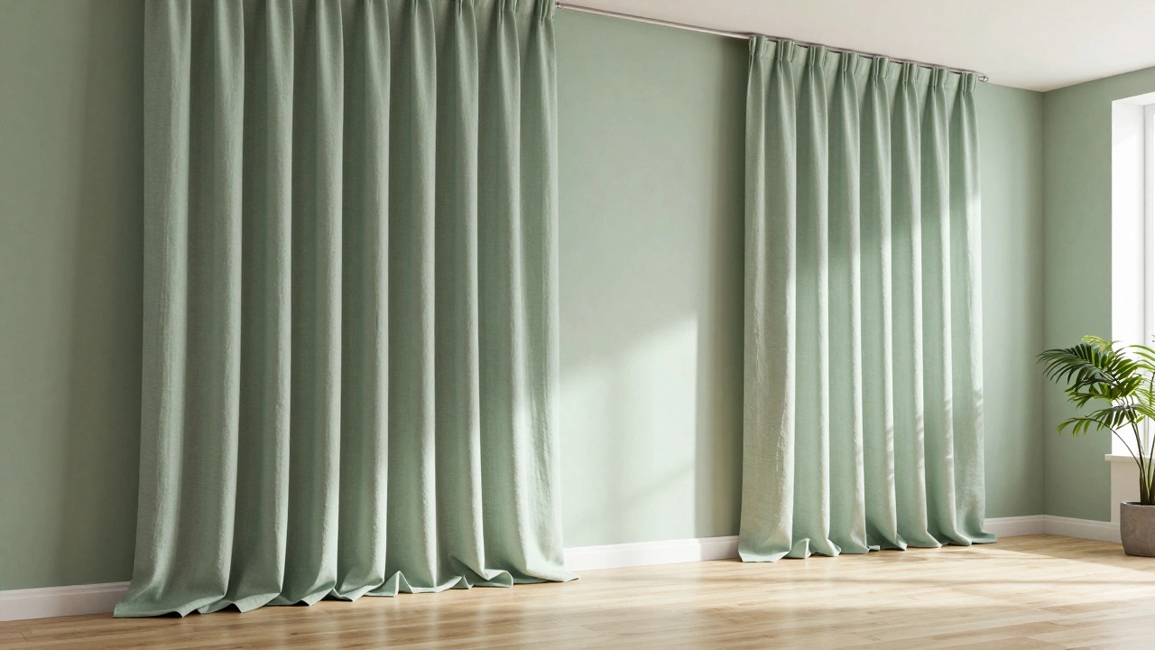
This works exceptionally well in open-concept homes where you want flow between spaces. Imagine a hallway painted in a soft sage green. If you hang heavy navy blue curtains, the transition feels abrupt. But if those same curtains are in a matching sage tone, the eye glides smoothly through the room. It’s less about hiding the window and more about expanding the perceived boundaries of the room.
However, there’s a catch. If you match the wall exactly, you risk losing definition. The window frame can disappear, making the room feel flat. To fix this, play with texture. A matte wall paired with textured linen curtains in the exact same hue adds depth without breaking the color scheme. The light catches the weave of the fabric differently than the paint, creating subtle interest that keeps the eye engaged.
When Matching Furniture Makes Sense
On the flip side, coordinating your window treatments with your furniture creates a unified, anchored look. This approach is popular in traditional interiors or rooms with statement pieces. If you have a bold emerald green sofa, pulling a similar shade from the upholstery for your curtains ties the seating area together. It signals intentionality, telling guests that every piece was chosen with care.
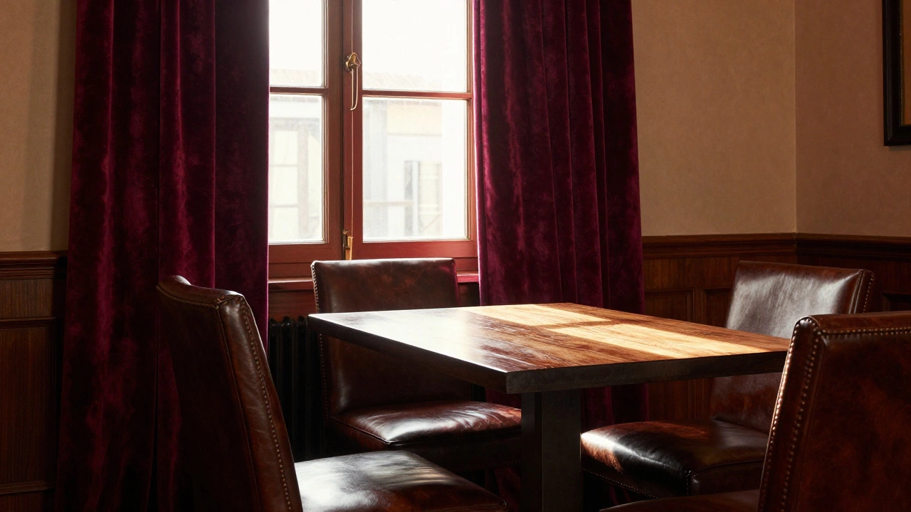
This strategy shines in formal living rooms or dining areas where symmetry and balance are key. Picture a dark walnut dining table surrounded by leather chairs. Curtains in a complementary deep brown or burgundy reinforce the warmth and richness of the wood and leather. It creates a "nesting" effect, making the space feel cozy and intimate.
But beware of the "matchy-matchy" trap. If your curtains, sofa, armchairs, and rug all share the exact same color family, the room can feel sterile or dated. Think of it like wearing an outfit where every item is the same shade of blue-it lacks personality. Instead, aim for harmony. Use the furniture color as inspiration, not a copy-paste job. Pick up a secondary accent color from a pillow or throw blanket instead. This adds layers of visual interest while maintaining cohesion.
The Power of Neutrals: The Safe Harbor
Stuck between a bold wall and eclectic furniture? Reach for neutrals. Shades like ivory, taupe, warm grey, or crisp white act as visual rest stops. They don’t compete with either the walls or the furniture, allowing both to shine. This is especially useful in rental properties or transitional spaces where you might change furniture frequently but keep the walls static.
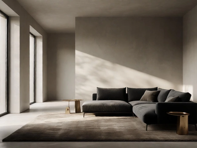
Neutrals also offer versatility. A set of oatmeal-colored linen curtains looks just as good against a pale yellow wall as it does next to a charcoal grey sectional. They provide a clean backdrop that lets artwork, plants, and lighting fixtures take center stage. Plus, they’re timeless. Trends come and go-think of the fleeting popularity of bright orange accents-but neutrals remain relevant year after year.
To avoid looking bland, focus on quality materials. Cheap synthetic fabrics in neutral tones can look dull and lifeless. Opt for natural fibers like cotton, linen, or wool blends. Their inherent texture and slight variations in dye lot add character and warmth. A high-quality neutral curtain feels luxurious and inviting, elevating even the simplest room.
Contrast: The Bold Alternative
Sometimes, neither matching nor blending is the answer. Sometimes, you need contrast. Choosing a curtain color that contrasts sharply with both the walls and furniture can create a striking focal point. This works best in rooms with plenty of natural light and high ceilings, where the drama doesn’t overwhelm the space.
For example, in a room with white walls and light oak furniture, deep charcoal or black curtains add sophistication and modern edge. In a space with pastel pink walls and white furniture, navy blue curtains introduce a sense of calm authority. Contrast draws attention to the windows themselves, framing the view outside like a painting.
Just ensure the contrasting color appears elsewhere in the room to tie everything together. Maybe it’s in a vase on the coffee table, a stripe in the rug, or a framed print on the wall. This repetition prevents the curtains from feeling isolated or accidental. It’s about creating a dialogue between elements, not shouting over them.
Practical Considerations Beyond Aesthetics
While style matters, function shouldn’t be ignored. Darker curtains absorb more heat, which can be beneficial in sunny rooms during summer but problematic in cooler climates. Lighter fabrics reflect sunlight, keeping rooms brighter but offering less privacy. Sheer curtains diffuse light beautifully but do little to block views or insulate against temperature changes.
Think about maintenance too. Light-colored curtains show stains and dust more easily, requiring frequent washing. Darker hues hide dirt better but may fade faster under direct sun exposure. If you have pets or young children, consider durable, washable fabrics in mid-tones that balance practicality with style.
Also, measure twice. Curtains that pool slightly on the floor (about half an inch) look elegant and intentional. Those that stop abruptly at the sill can make windows look smaller. Ensure your hardware is sturdy enough to support the weight of the fabric, especially for heavier materials like velvet or blackout linings.
| Strategy | Best For | Risk | Pro Tip |
|---|---|---|---|
| Match Walls | Small rooms, low ceilings | Flat appearance | Use textured fabric |
| Match Furniture | Cohesive themes, formal spaces | Monotony | Pick up accent colors |
| Neutral Tones | Versatility, rentals | Blandness | Invest in quality materials |
| High Contrast | Dramatic impact, large rooms | Overwhelming effect | Echo color elsewhere |
Testing Your Choices Before Committing
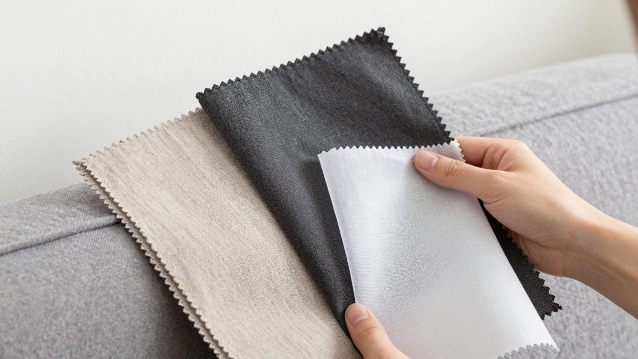
Before you order custom drapes or buy off-the-shelf panels, test your choices. Hold fabric swatches against your wall and furniture at different times of day. Morning light is cool and blue-toned, while afternoon sun is warm and golden. Evening artificial light casts yet another hue. A color that looks perfect at noon might clash horribly at dusk.
Take photos with your phone. Screens render colors differently than our eyes, giving you another perspective. Ask friends for honest feedback-they’ll notice details you’ve become blind to. And remember, you can always layer. Start with simple sheers and add heavier drapes later if needed. Flexibility is key in interior design.
Finally, trust your gut. Rules are guidelines, not laws. If a mismatched combination makes you smile and feel comfortable, go for it. Your home should reflect your personality, not just follow trends. After all, you’re the one who has to live with those curtains every single day.
Should curtains be lighter or darker than the wall?
It depends on the effect you want. Lighter curtains blend into the background, making rooms feel airy and spacious. Darker curtains add drama and coziness, drawing attention to the windows. For balanced proportions, many designers recommend curtains slightly darker than the walls but lighter than the largest furniture piece.
Can I mix patterns in my curtains and furniture?
Yes, but keep scale and color in mind. Pair a large-scale patterned curtain with solid-colored furniture, or vice versa. Ensure both patterns share at least one common color to unify the look. Avoid mixing multiple busy patterns unless you’re experienced with interior design principles.
What if my walls are white? What curtain color should I choose?
White walls are a blank canvas. You can go bold with colorful curtains, stick to neutrals for minimalism, or use textured whites for subtle elegance. Consider the undertone of your white paint-cool whites pair well with greys and blues, while warm whites complement beiges and creams.
Do curtains need to match the blinds?
Not necessarily. Blinds are functional; curtains are decorative. Many people install neutral blinds (like white or grey) and let the curtains carry the color or pattern. Just ensure the hardware styles complement each other for a polished finish.
How wide should my curtains be compared to the window?
Aim for double the width of the window frame. So, if your window is 4 feet wide, your combined curtain panels should measure 8 feet. This ensures fullness when closed and allows light to filter through gaps when open, avoiding a stretched-out look.