Home Color Value Impact Calculator
Select Your Palette Strategy
Based on market data from the article.
Impact Analysis
Select an Exterior and Interior option to see the analysis.
Ever stood in front of a house and felt an instant pull to walk inside? Or maybe you passed another that made you want to speed up just to get away from it. Chances are, the difference wasn't the roofline or the window frames. It was the color. We often think of paint as a cheap cosmetic fix, something you slap on before listing to hide scuffs. But in the world of real estate, color is currency. It’s one of the few upgrades that costs less than $500 but can swing your home’s perceived value by tens of thousands.
The question isn't just "what looks nice." It's "what makes a buyer open their wallet?" When we talk about what color makes a house more valuable, we aren't talking about matching your throw pillows. We're talking about psychology, market trends, and the brutal reality of first impressions. If you’re planning to sell, or even just renovate with an eye toward future equity, getting this right matters more than installing that expensive smart fridge.
The Curb Appeal Equation: Why Exterior Color Matters Most
You have exactly eight seconds. That’s how long it takes for a potential buyer to form an opinion about your home when they drive by. In today’s digital-first market, those eight seconds happen online, scrolling through Zillow or Realtor.com. Your exterior photo is the gatekeeper. If the color screams "dated" or "too bold," they click past. If it whispers "move-in ready," they click in.
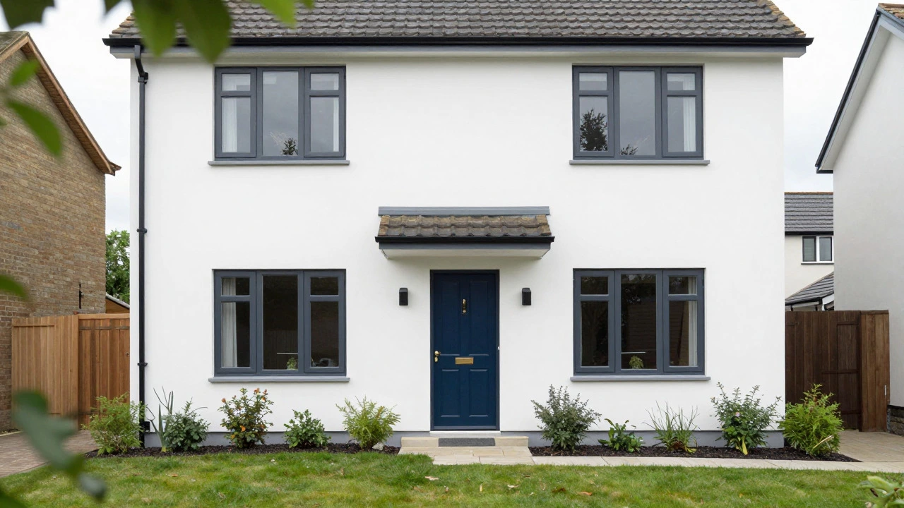
The safest bet for maximum value remains neutral. White, off-white, light gray, and beige dominate the top-selling homes across North America. Why? Because these colors act as a blank canvas. They make the architecture look cleaner, the landscaping pop, and the home feel larger. A crisp white trim against a light gray siding creates contrast that reads as modern and well-maintained. Darker colors, like charcoal or navy, can work if done sparingly-think front doors or shutters-but painting the entire facade black or deep red limits your buyer pool significantly. You might love the moody aesthetic, but the average buyer sees maintenance nightmares and heat absorption issues.
| Color Palette | Buyer Reaction | Value Impact |
|---|---|---|
| White / Off-White | Clean, Classic, Bright | High (Broadest Appeal) |
| Light Gray / Beige | Modern, Neutral, Safe | High (Trendy yet Timeless) |
| Dark Charcoal / Navy | Bold, Sophisticated | Moderate (Niche Appeal) |
| Bright Red / Yellow | Dated, Aggressive | Low (Limits Buyers) |
If you live in a historic district, the rules change slightly. Here, authenticity adds value. A Victorian home painted in historically accurate pastels can command a premium because it respects the neighborhood character. But for the vast majority of suburban and urban homes, neutrality wins. It signals to buyers that they don’t have to strip-paint the whole place before they unpack their boxes.
Interior Neutrals: The Blank Canvas Strategy
Once they step inside, the game shifts from attraction to visualization. Buyers need to imagine their life in your space. Bold colors block that imagination. If your living room is painted a deep forest green, a buyer who loves that shade thinks, "Perfect!" But the other 99% think, "Great, I have to repaint this immediately." That mental note translates into a lower offer. They’re mentally deducting the cost and hassle of repainting.
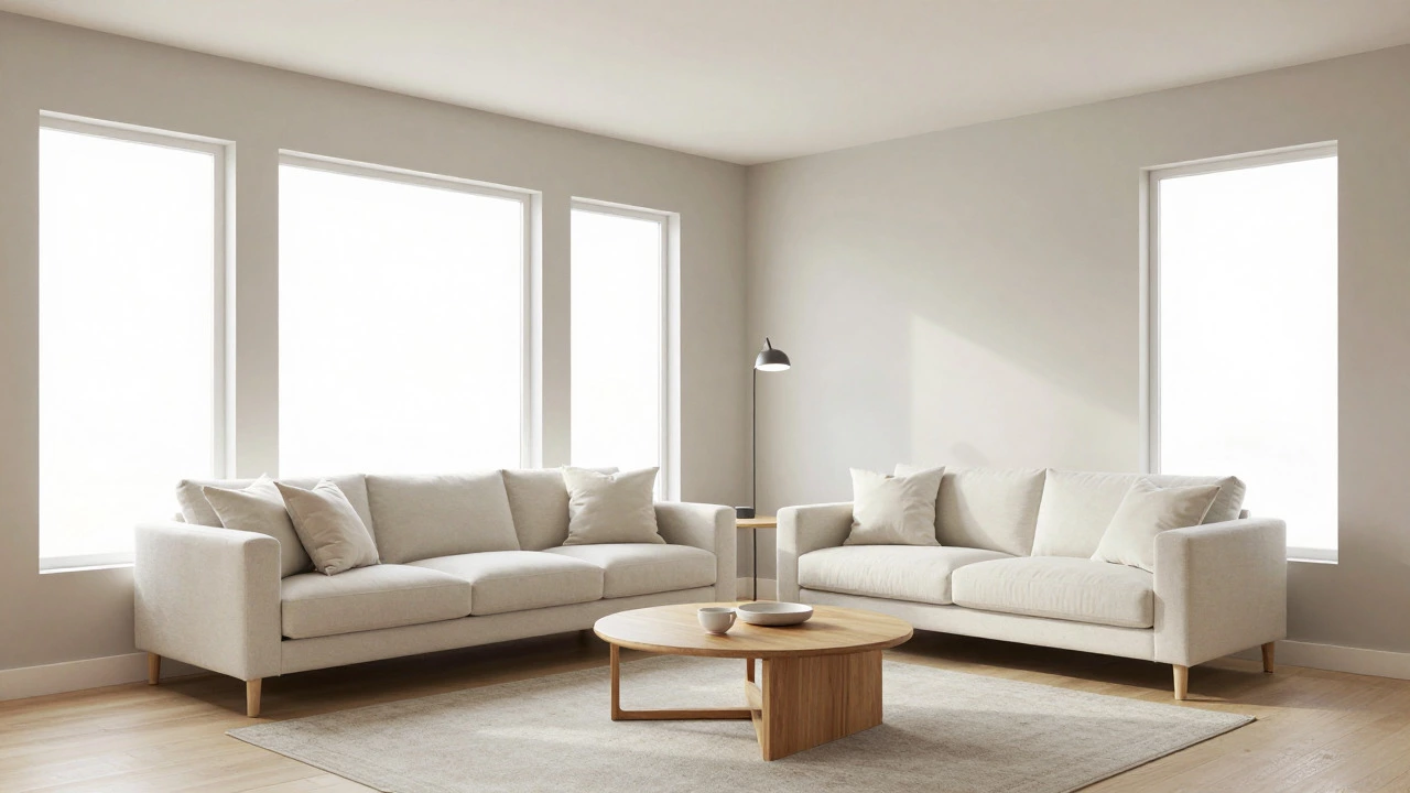
The gold standard for interior resale value is "greige." It’s that sweet spot between gray and beige. Pure white can feel sterile and hospital-like, while pure beige can feel dated and yellowish. Greige offers warmth without being trendy. It reflects natural light beautifully, making rooms feel bigger and airier. This is crucial for smaller homes or those with limited windows. Light colors bounce light around; dark colors absorb it. In a city like Vancouver, where overcast skies are common, maximizing natural light through wall color is not just aesthetic-it’s functional.
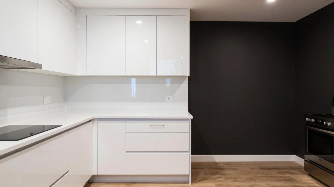
Kitchens and bathrooms are the high-stakes zones. Here, whites and very light grays reign supreme. These spaces are judged on cleanliness above all else. A bright white kitchen cabinet or wall feels sanitary and fresh. Dark walls in a bathroom can make a small powder room feel claustrophobic. Stick to cool tones in kitchens if you have stainless steel appliances, as warm beiges can clash with the metallic finish. Cool grays complement the silver tones, creating a cohesive, modern look that appeals to tech-savvy millennials and Gen Z buyers who currently drive much of the housing demand.
The Psychology of Color in High-Traffic Areas
While neutrality is king, subtle variations in hue can guide buyer emotion. This is where you can add personality without risking value. The key is subtlety. Think tinted water, not paint-by-numbers.
- Living Rooms: Soft blues or sage greens can promote calmness. These colors suggest a relaxing environment, which is exactly what buyers want in a family gathering space. Avoid anything too saturated. A pale sky blue works; a royal blue does not.
- Bedrooms: Muted lavenders, soft taupes, or pale blues signal rest. Bedrooms should feel like sanctuaries. Dark colors here can feel oppressive, especially in smaller master suites.
- Dining Rooms: Warm neutrals like cream or light terracotta can stimulate appetite and conversation. However, keep it light. Heavy reds can make the space feel hot and intense.
The goal is to create an emotional response that aligns with the room’s purpose. You want the buyer to feel relaxed in the bedroom, energized in the kitchen, and calm in the living area. Color is the cheapest tool you have to engineer these feelings. Using the wrong color sends mixed signals. A bright orange dining room might feel energetic, but it also feels chaotic. Chaos doesn't sell homes; order and tranquility do.
Common Mistakes That Kill Value
I’ve seen homes sit on the market for months simply because the owner loved their design choices too much. Here are the biggest pitfalls that hurt resale value:
- Ignoring Natural Light: A color that looks great in the store under fluorescent lights might look muddy in your north-facing living room. Always test paint samples on large boards at different times of day. Morning light is cool; evening light is warm. Your walls will shift tone throughout the day.
- Trend-Chasing: Remember when grey was everywhere? Now, some buyers associate heavy greys with the "sad grey" trend of the early 2010s. Trends cycle fast. Neutrals cycle slowly. If you pick a color because it’s "in" this year, it’ll look dated in three. Pick a color that will still look good in ten.
- Overusing Accent Walls: Accent walls were popular a decade ago. Today, they often look like a mistake waiting to happen. Buyers prefer uniformity. If you must use an accent, make it a built-in feature, like a bookshelf niche, rather than an entire wall. Full walls of bold color fragment the space visually.
- Forgetting Trim and Doors: Painting your trim the same color as your walls can make ceilings look lower and rooms boxy. Crisp white trim provides definition and structure. It frames the room. Skipping this detail makes even expensive paint look cheap.
Regional Differences and Local Taste
Where you live changes the equation. In coastal areas, whites and seafoam greens perform exceptionally well because they echo the environment. In desert regions, earth tones like terracotta, sand, and olive green blend with the landscape and reflect heat. In dense urban centers like New York or Toronto, darker exteriors can convey sophistication and privacy, provided the building style supports it.
In Vancouver, our rainy climate means we crave brightness indoors. Homes with dark interiors often struggle unless they have massive windows flooding the space with light. For most typical homes, lighter palettes help combat the gloom of winter months. Buyers here prioritize warmth and light. A home that feels cozy but bright will outperform one that feels moody and dim. Check local sold listings in your specific neighborhood. Look at the photos of homes that sold quickly. What colors did they use? Mimic that success. Real estate is hyper-local. What works in Seattle might not work in Phoenix.
Cost vs. Return: Is Repainting Worth It?
Let’s talk numbers. Painting the interior of a 2,000-square-foot home typically costs between $1,500 and $3,000 if you hire professionals. Doing it yourself cuts that to material costs only, roughly $500 to $800 for quality paint. Compared to the average home price, this is negligible. Yet, studies consistently show that freshly painted homes sell faster and closer to asking price. The return on investment isn't just in the final dollar amount; it's in the time saved on the market. Every month a home sits unsold, you pay mortgage, insurance, and utilities. Speed sells. Paint accelerates speed.
Don't skimp on paint quality. Cheap paint requires multiple coats, shows brush strokes, and fades faster. Premium paints like Benjamin Moore or Sherwin-Williams cover better and last longer. Buyers notice texture. A smooth, flawless finish signals care. A patchy, uneven finish signals neglect. Treat paint as an investment in perception, not just a commodity.
Next Steps for Sellers and Renovators
If you’re preparing to list, start with a professional staging consultation. Stagers know which colors move homes in your specific market. They’ll tell you if your current palette is working against you. If you’re renovating, buy sample pots. Live with the color for a week. See it in rain, sun, and artificial light. Ask friends for honest feedback-not just "do you like it?" but "does this feel welcoming?"
Remember, you’re not decorating for yourself anymore. You’re designing for the lowest common denominator of buyer taste. That doesn’t mean boring. It means universally appealing. Clean lines, ample light, and neutral tones create a backdrop that allows buyers to project their own dreams onto your property. That projection is what turns a viewing into an offer.
What is the best exterior color to increase home value?
The best exterior colors for increasing home value are neutral tones like white, off-white, light gray, and beige. These colors appeal to the broadest range of buyers, making the home look clean, modern, and well-maintained. They also enhance curb appeal by contrasting nicely with landscaping and architectural details.
Do bold interior colors decrease home value?
Bold interior colors can decrease home value because they limit the buyer pool. Many buyers struggle to visualize their own furniture and decor against strong backgrounds like deep reds or navy blues. This leads them to mentally deduct the cost and effort of repainting, resulting in lower offers. Neutral colors allow buyers to imagine themselves living in the space.
Is it worth repainting my house before selling?
Yes, repainting is one of the highest ROI improvements you can make. It costs relatively little compared to other renovations but significantly boosts curb appeal and interior freshness. Fresh paint suggests the home has been well-cared for, reducing buyer concerns about hidden maintenance issues. It also helps the home sell faster, saving you money on holding costs.
What paint color is best for a kitchen to sell?
White or very light gray is the best paint color for a kitchen to sell. Kitchens are judged heavily on cleanliness and brightness. White reflects light, making the space feel larger and more sanitary. It also complements most cabinet styles and appliance finishes, creating a cohesive and modern look that appeals to a wide audience.
How does lighting affect paint color choice for resale?
Lighting dramatically affects how paint colors appear. North-facing rooms receive cooler, bluer light, which can make warm colors look dull and cool colors look stark. South-facing rooms get warm, yellow light, enhancing warm tones. Always test paint samples in the actual room at different times of day to see how natural and artificial light changes the hue. Choosing a color that works in both morning and evening light ensures consistent appeal.