Luxury Color & Material Estimator
Select a room type and desired atmosphere to discover the most effective luxury color palette and complementary materials.
1. Choose Your Space
Recommended Primary Color
--
#000000
Psychological Effect: --
Design Tip: --
Complementary Materials & Accents
To achieve true luxury, pair your wall color with these tactile elements:
Pro Tip: Use textured wallpapers or layered lighting to add depth. Avoid flat, uniform finishes.
Select options on the left and click "Reveal Luxury Palette" to see recommendations.
You walk into a room and instantly feel the weight of money. It’s not just the marble floors or the velvet chairs; it’s the walls. You might think gold leaf is the only way to signal status, but that’s a rookie mistake. The truth about what color evokes wealth is more nuanced than a single hue. It’s about depth, saturation, and how light hits the surface. In 2026, the trend has shifted away from the stark minimalism of the early 2020s toward rich, moody tones that tell a story of heritage and quiet confidence.
If you are refreshing your space with new wallpaper or paint, understanding the psychology behind these choices saves you from spending thousands on the wrong vibe. Let’s break down which colors actually read as "expensive" and why they work, so you can curate a home that feels curated rather than cluttered.
The Psychology Behind Expensive Colors
Why do certain colors trigger a feeling of abundance? It comes down to rarity and history. For centuries, specific pigments were difficult to produce. Tyrian purple was extracted from sea snails, making it affordable only to royalty. Ultramarine blue came from lapis lazuli mined in Afghanistan, costing more than gold. Today, we don’t pay by the gram for pigment, but our brains still associate these deep, complex hues with value.
When you choose a color like deep emerald or navy, you are tapping into a historical association with stability and power. Lighter, pastel colors often evoke playfulness or youth, which can sometimes read as casual or temporary. Wealthy interiors tend to favor permanence. They want walls that look like they have been there for decades, holding their own against heavy furniture and intricate art. This is where color psychology meets practical design: darker, saturated colors absorb light, creating a sense of intimacy and enclosure that feels protective and exclusive.
Deep Greens and Blues: The New Neutrals
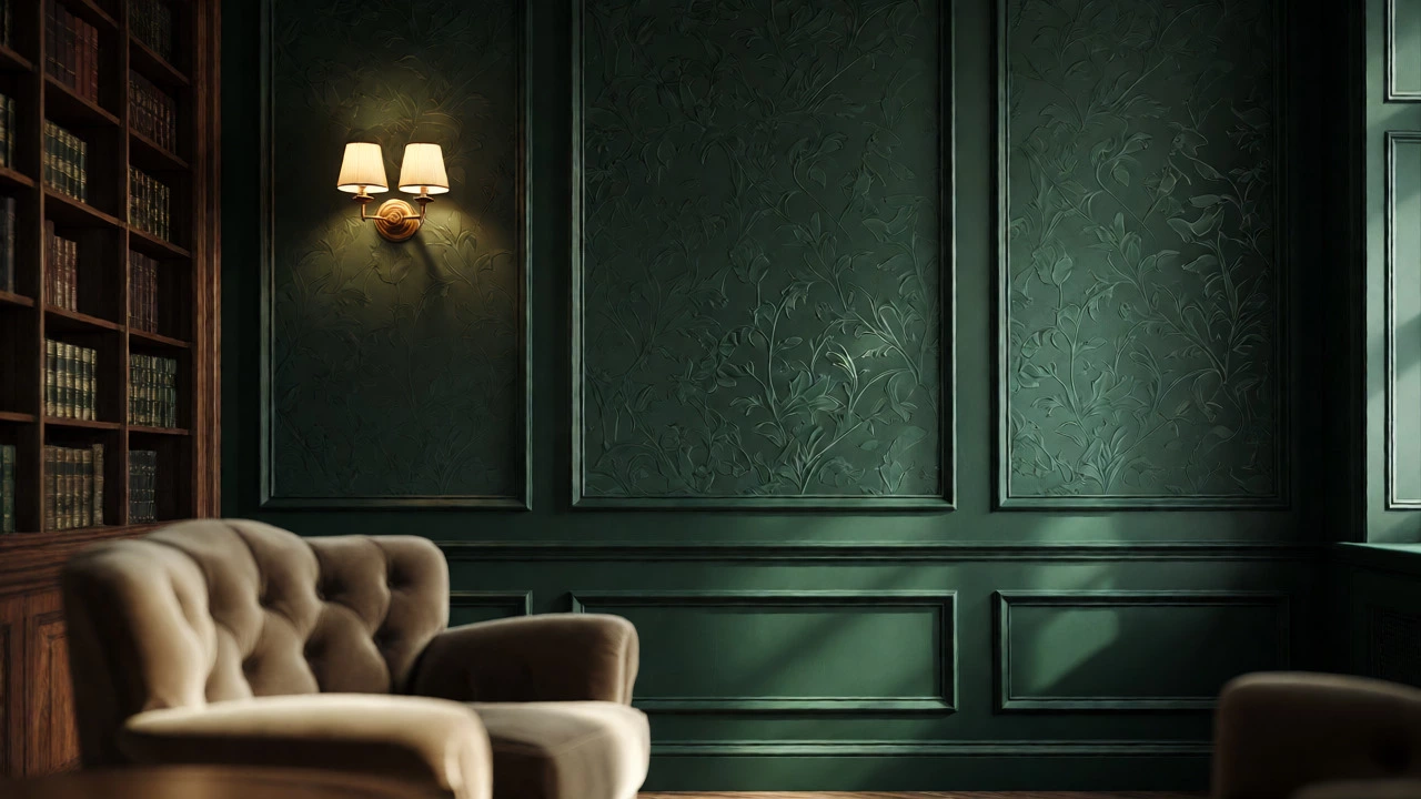
Gone are the days when beige was the safe bet for high-end homes. While neutrals still have their place, the current landscape favors deep greens and navy blues. These shades are surprisingly versatile. A forest green wall pairs beautifully with brass fixtures, walnut wood, and cream upholstery. It mimics the natural world, bringing an organic richness indoors without feeling rustic.
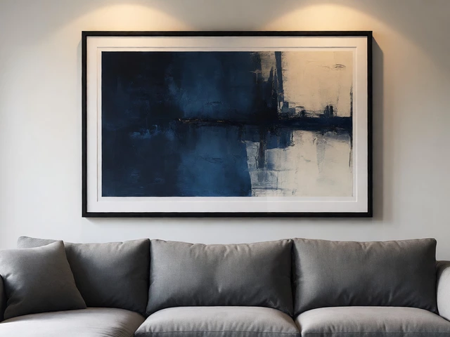
Navy blue operates similarly but leans more toward corporate sophistication. Think of the walls in a private members' club or a high-end law firm. It projects authority. When used in a bedroom, it promotes restful sleep due to its calming properties. If you are hesitant to commit to a full room, try using these colors on accent walls or ceilings. Painting the ceiling a dark shade can lower the visual height of a room, making large spaces feel cozier and more intimate-a trick often used in boutique hotels.
The Role of Texture in Luxury Perception
Color alone isn’t enough. Two walls painted the same shade of charcoal will look different if one is flat matte and the other has a subtle texture. Wealth is tactile. It’s about what you can see and feel. Flat, uniform surfaces can sometimes look cheap because they lack dimension. To elevate your interior design, consider wallpapers with embossed patterns, grasscloth textures, or metallic accents.
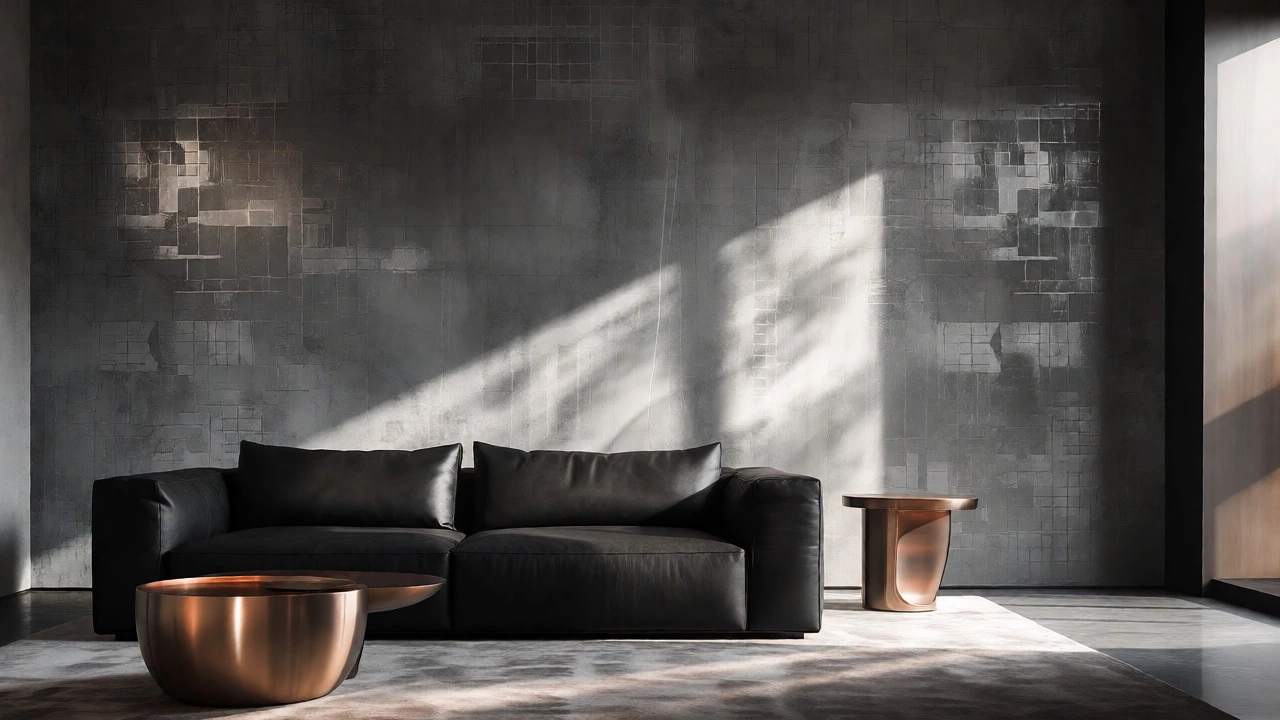
For example, a dark charcoal wallpaper with a faint geometric pattern catches the light differently throughout the day. As the sun moves across Vancouver’s sky, the shadows shift, adding life to the static surface. This dynamic quality suggests craftsmanship. Mass-produced, smooth vinyl prints often fail to capture this depth. Look for materials that interact with light. Silk-like finishes reflect softly, while matte textures absorb it, creating a velvety appearance that draws people in.
Warm Metals and Earth Tones
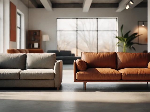
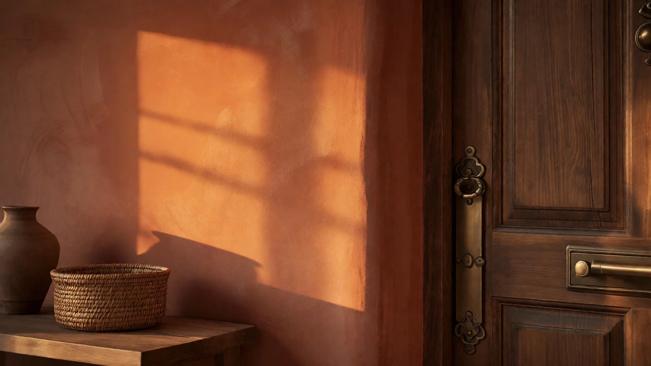
While cool tones dominate the modern luxury scene, warm earth tones are making a strong comeback. Terracotta, burnt orange, and deep ochre evoke warmth and groundedness. These colors work exceptionally well in living areas where conversation happens. They create an inviting atmosphere that feels generous and open.
Pairing these warm hues with metallic accents is key. Gold, brass, and copper reflect light and add a sparkle that signals affluence. However, avoid shiny, chrome-like finishes which can look industrial. Instead, opt for brushed or antique metals. A brass sconce against a terracotta wall creates a contrast that is both striking and harmonious. This combination feels collected over time, suggesting that the homeowner has invested in pieces with character rather than buying everything off the shelf at once.
| Color Family | Psychological Effect | Best Room Application | Complementary Materials |
|---|---|---|---|
| Deep Emerald Green | Stability, Growth, Heritage | Library, Dining Room | Brass, Walnut, Velvet |
| Navy Blue | Authority, Calm, Trust | Home Office, Bedroom | Gold, Marble, Linen |
| Charcoal Grey | Sophistication, Modernity | Living Room, Kitchen | Concrete, Leather, Steel |
| Terracotta | Warmth, Groundedness | Entryway, Sunroom | Copper, Rattan, Clay |
Avoiding Common Mistakes
One major pitfall is using too many bold colors at once. If every wall is a different intense shade, the room can feel chaotic rather than curated. Wealth implies control. Choose one dominant color and stick to it. Use secondary colors sparingly through accessories like rugs, cushions, or artwork.
Another mistake is ignoring lighting. Dark colors require adequate illumination. If you paint a small, windowless bathroom black, it might feel like a cave unless you add layered lighting. Use sconces, floor lamps, and dimmers to adjust the mood. Natural light also plays a huge role. In Vancouver, where gray skies are common, warm artificial lighting helps counteract the cool daylight, ensuring your rich wall colors glow rather than fade.
Implementing Wealth Colors in Your Home
Ready to make the switch? Start small. Test samples on your walls at different times of the day. Observe how the color changes under morning sunlight versus evening lamp light. This step prevents costly regrets later.
- Start with Accent Walls: If you’re nervous about commitment, paint one wall in a deep hue. Frame it with white trim to keep the space feeling airy.
- Mix Textures: Combine smooth paints with textured wallpapers. A smooth navy wall next to a textured charcoal panel adds visual interest.
- Focus on Hardware: Swap out plastic knobs for metal ones. Small details matter. Heavy, solid hardware reinforces the perception of quality.
- Consider Ceiling Color: Don’t forget the fifth wall. Painting the ceiling a slightly darker shade than the walls can enhance the cozy, luxurious feel.
Remember, true luxury isn’t about showing off. It’s about comfort, quality, and intentionality. When you choose colors that resonate with these values, your home becomes a sanctuary that reflects your personal taste and financial wisdom.
Does black always make a room look expensive?
Not necessarily. Black can look dramatic and sophisticated, but if the finish is poor or the lighting is bad, it can appear cheap or oppressive. Matte black with good texture and layered lighting tends to read as more luxurious than glossy black, which can highlight imperfections.
Is gold wallpaper outdated?
Bright, shiny gold wallpaper can look dated. However, muted gold, brass, or metallic accents in subtle patterns are very much in style. They add warmth and reflection without overwhelming the space, fitting perfectly into modern luxury aesthetics.
How does lighting affect color perception in wealthy interiors?
Lighting dramatically changes how color is perceived. Warm lighting (2700K-3000K) enhances reds, oranges, and yellows, making them feel richer. Cool lighting can wash out warm tones but makes blues and greens appear crisper. Layered lighting allows you to adjust the mood and highlight the depth of your chosen colors.
Can small apartments benefit from wealth-evoking colors?
Absolutely. Dark colors can blur boundaries and make small spaces feel larger and more mysterious. Using consistent deep tones on walls and baseboards can create a seamless, expansive look. Just ensure you have sufficient lighting to prevent the space from feeling cramped.
What is the most timeless luxury color?
Navy blue and charcoal grey are widely considered timeless. They transcend fleeting trends and pair well with almost any decor style, from traditional to contemporary. Their neutrality allows them to serve as a backdrop for changing accessories while maintaining a core sense of elegance.