Modern Interior Color Simulator
Select a base color and your room's light exposure to see how the mood shifts. This tool helps you avoid common mistakes like choosing 'greige' for north-facing rooms.
Analysis Result:
You walk into a showroom or scroll through Pinterest, and suddenly every wall looks like a shade of beige. Is that what "modern" really means? Or is there more to it? The truth is, modern house colors are not just about picking a paint can from the gray section. They are about setting a mood, defining space, and reflecting how you actually live in your home. If you are renovating or building new, getting this wrong can make your beautiful architecture feel cold or chaotic. Getting it right makes the space feel intentional and calm.
Why Color Choice Matters More Than You Think
Color does heavy lifting in interior design. It changes how big a room feels, how much light bounces around, and even how fast time seems to pass when you are sitting on your sofa. In modern homes, where lines are clean and clutter is low, color becomes the primary tool for warmth and personality. Without the distraction of ornate moldings or busy patterns, the wall color is the star of the show.
Think about the last time you entered a room that felt "off." Was it the furniture? Probably not. It was likely the clash between the wall tone and the lighting, or a saturation level that felt too aggressive for a resting space. Modern design thrives on balance. You want a palette that supports the structure without fighting it. This isn't just aesthetic preference; it's psychological impact. Cool tones lower heart rates; warm tones encourage conversation and appetite.
The Core Palette: Neutrals Are Not Just White
When people hear "modern," they often picture stark white boxes. But true modern interiors rarely use pure, bright white on large surfaces. Pure white reflects too much light, creating glare and making shadows harsh. Instead, designers rely on complex neutrals-colors that have undertones of gray, brown, or blue.
| Base Color | Undertone | Best For | Avoid If... |
|---|---|---|---|
| Greige | Brown/Gray mix | Living rooms, open plans | Room has very cool north-facing light (can look muddy) |
| Warm White | Yellow/Cream | Kitchens, bathrooms | Space feels already too yellow under incandescent bulbs |
| Cool Gray | Blue/Green | Bedrooms, offices | Wood floors have strong orange/red tones |
| Off-White | Soft Gray | Trim, ceilings, cabinets | Walls are a deep saturated color (contrast may be too high) |
Take greige, for example. It’s the darling of modern design because it bridges the gap between cozy and sleek. It works with almost any wood tone and metal finish. However, context is key. If your Vancouver home faces north, a greige with a pink undertone might turn greenish in the winter dusk. Always test samples at different times of day before committing.
Adding Depth with Monochromatic Layers
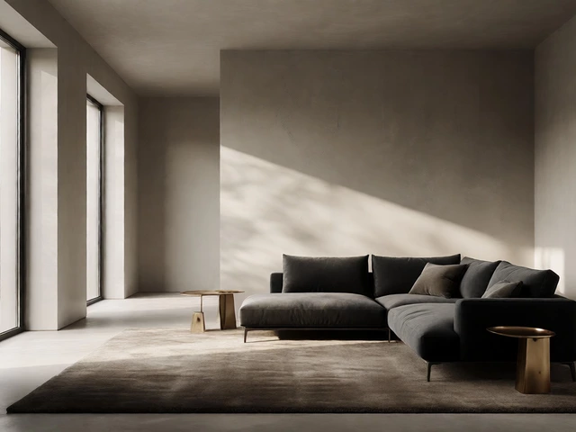
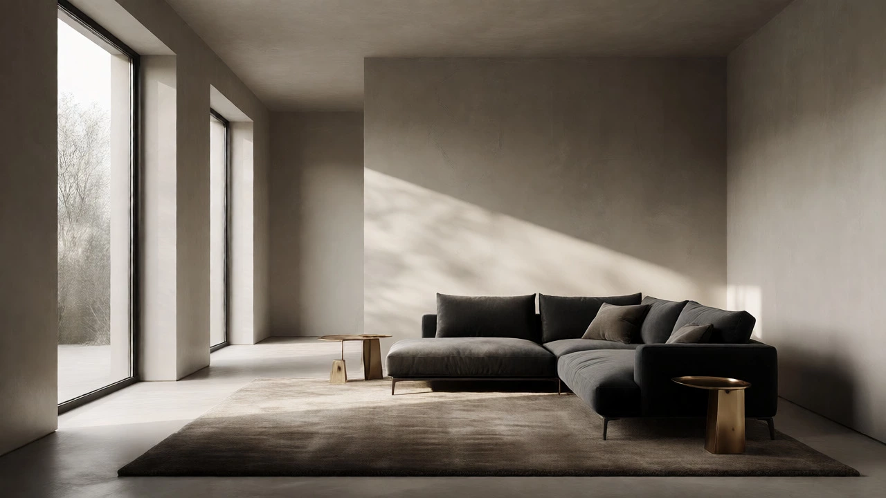
One common mistake in modern homes is using the exact same color everywhere. It flattens the space. To keep a monochromatic scheme interesting, you need texture and slight variations in value. Imagine a living room painted entirely in a soft charcoal. If the sofa, rug, curtains, and pillows are all flat matte fabric in that same hex code, the room looks like a cave.
Instead, layer materials. Use a velvet cushion in a slightly lighter shade, a wool rug in a darker tone, and leather accents that catch the light. The eye perceives depth through contrast in texture, not just hue. This approach keeps the visual noise low-which is essential for modern aesthetics-while preventing the space from feeling sterile.
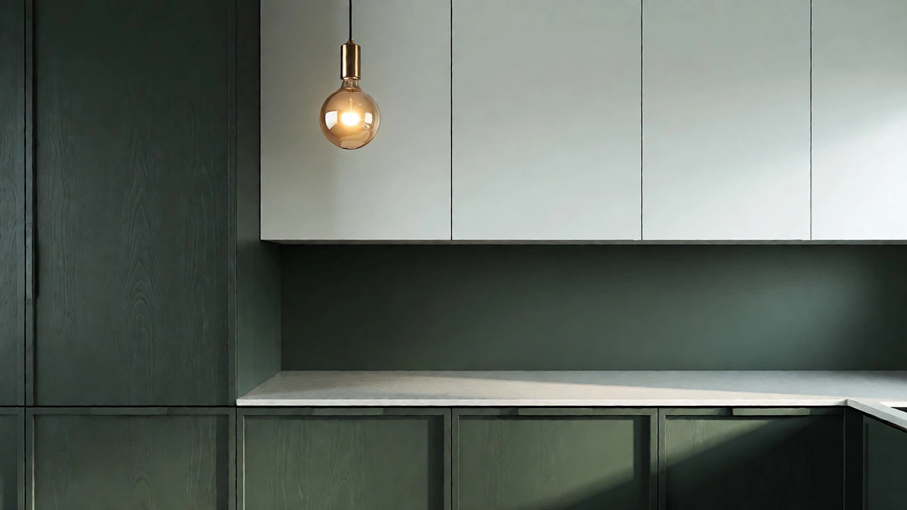
Consider the kitchen. A popular trend is two-tone cabinetry. Lower cabinets in a deep navy or forest green, upper cabinets in a crisp off-white. This grounds the room while keeping the ceiling line airy. It breaks up the monotony without introducing clashing colors.
Accent Walls and Bold Choices
Do you need an accent wall? Not always. In fact, overusing them can date a room quickly. A better strategy is to use bold color on smaller, specific elements. Think bookshelves painted inside, the back of a pantry door, or a single piece of statement furniture.
If you do want a full accent wall, place it behind the focal point. In a living room, that’s usually the fireplace or TV. In a bedroom, it’s the headboard wall. Avoid painting the wall opposite the window dark, as it can absorb too much natural light and make the room feel smaller during the day.
What colors work best for accents in a modern home? Deep, desaturated tones. Sage green, terracotta, slate blue, or burnt sienna. These colors add richness without the neon intensity that can feel cheap. They pair beautifully with black hardware and brass fixtures, which are staples of contemporary hardware choices.

Lighting Changes Everything
You cannot talk about color without talking about light. Natural light shifts throughout the day and season. Artificial light changes based on bulb temperature. A wall that looks perfect under 3000K warm LEDs might look sickly under 5000K daylight bulbs.
- North-facing rooms: Receive cool, bluish light. Warm whites and creamy beiges help counteract the chill.
- South-facing rooms: Get abundant warm sunlight. Cool grays and blues prevent the space from feeling overheated.
- East-facing rooms: Bright morning light. Soft yellows or peaches glow beautifully here.
- West-facing rooms: Intense afternoon sun. Pale greens or lavenders can soften the harsh golden hour glare.
In Vancouver, where overcast days are common, relying solely on natural light is risky. Layer your artificial lighting. Use dimmers to adjust brightness, and choose bulbs with a high Color Rendering Index (CRI) above 90. This ensures colors appear true and vibrant, rather than washed out or distorted.
Matching Colors to Your Lifestyle
Finally, consider who lives in the house. A pristine white hallway sounds great until you have toddlers running through with sticky hands. High-gloss paints are easier to clean but highlight every bump and imperfection. Matte finishes hide flaws but scuff easily.
For families, durable eggshell or satin finishes in mid-tone neutrals offer the best compromise. They reflect enough light to feel open but are tough enough to wipe down. For a home office, avoid overly stimulating reds or oranges. Stick to calming blues or greens that promote focus. In entertainment spaces, deeper tones create intimacy and drama, encouraging guests to relax and linger.
Is gray still a good choice for modern homes?
Yes, but the type of gray matters. Stark, industrial grays are less popular now. Warmer grays with brown or taupe undertones (often called greige) are preferred because they feel inviting rather than cold. Pair them with natural wood textures to add warmth.
How many colors should I use in one room?
The classic rule is 60-30-10. 60% of the room should be your dominant color (usually walls), 30% a secondary color (furniture/rugs), and 10% an accent color (decor/art). In modern design, sticking to a tighter palette of 2-3 main hues plus neutrals often creates a cleaner, more sophisticated look.
Should ceilings be painted the same color as walls?
Not necessarily. Painting the ceiling the same color as the walls can blur boundaries and make small rooms feel larger by removing visual breaks. However, if the wall color is very dark, it might make the ceiling feel oppressive unless you have high ceilings. A safe bet is to match the ceiling to the trim or use a very light tint of the wall color.
What is the most versatile modern wall color?
A warm off-white or a soft greige. These colors act as a blank canvas, allowing you to change furniture and decor styles without repainting. They complement both cool and warm lighting conditions and work well with various flooring types, from hardwood to concrete.
Do dark colors make rooms look smaller?
Traditionally, yes. Dark colors absorb light, which can shrink perceived space. However, in modern design, dark walls can recede visually, creating a sense of infinite depth, especially in rooms with high ceilings or dramatic architectural features. It depends on the lighting and the specific shade used.