Neutral Furniture Compatibility Checker
Find Your Perfect Neutral
Enter your wall and floor colors to see which neutral furniture works best with your space. Based on the article "What Color Furniture Goes With Everything?"
Ever bought a gorgeous sofa or coffee table, only to realize it clashes with your walls, rug, or curtains? You’re not alone. The biggest mistake people make when buying furniture isn’t spending too much-it’s picking a color that looks great in the store but turns into a visual headache at home. The good news? There are a few colors that work with everything. They don’t fight your decor. They don’t date quickly. They just… fit. And if you’re trying to build a home that feels put-together without constant redecorating, these are the colors you need to know.
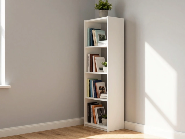
White: The Ultimate Blank Canvas
White furniture isn’t just for minimalist interiors. It’s the most flexible color you can own. A white sofa, side table, or bookshelf doesn’t demand attention-it gives attention. It lets your art, pillows, rugs, and even your wallpaper take center stage. White reflects light, making small rooms feel bigger and darker spaces feel brighter. It’s why designers use it in showrooms and why it’s the top choice for rental properties.
Real-world tip: If you’re worried about stains, choose a slightly off-white shade like cream, bone, or linen. These tones have subtle warmth and hide dirt better than pure white. Brands like IKEA, West Elm, and Article all offer durable white fabrics with stain-resistant finishes. A white linen sofa in a living room with navy curtains and oak floors? Works. White chair in a bright yellow kitchen? Still works. It’s not magic-it’s physics and psychology combined.
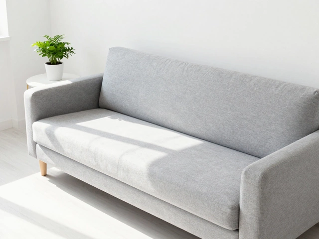
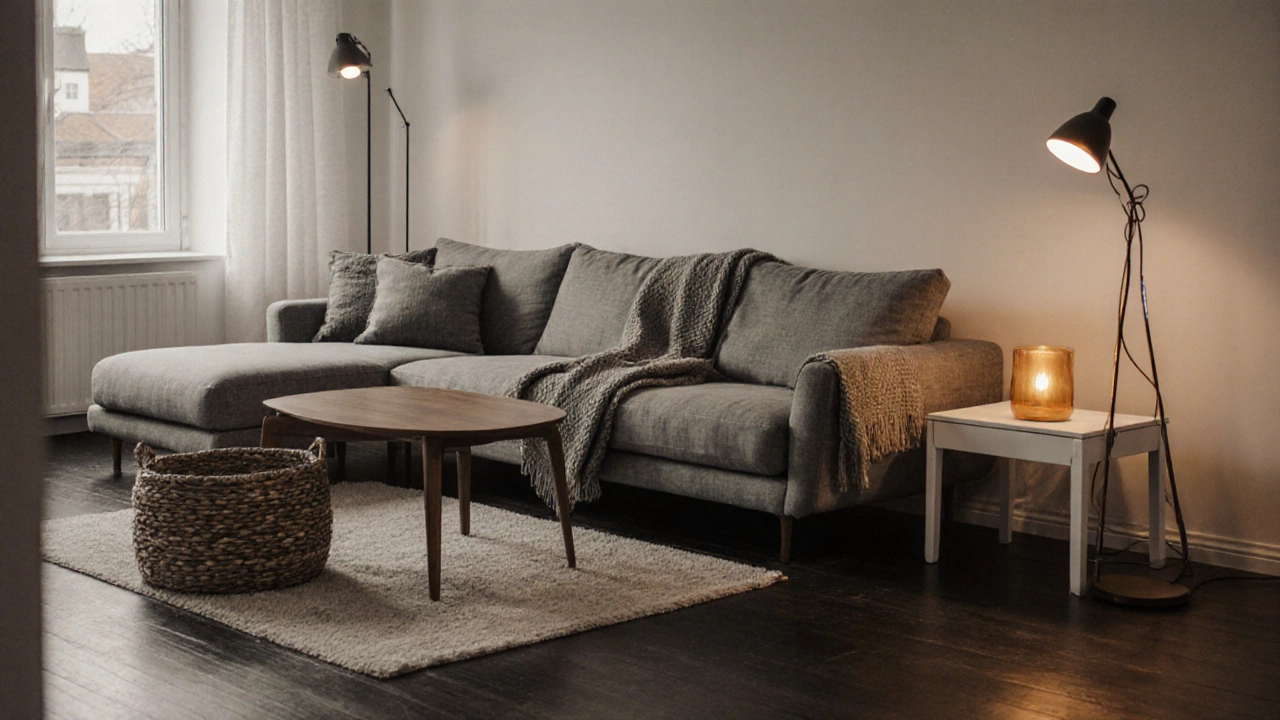
Gray: The Sophisticated Middle Ground
Gray is the quiet superstar of furniture color. It’s cooler than beige, warmer than black, and neutral enough to sit quietly behind bold accents. The key is picking the right gray. Avoid anything too cool or too dark unless you’re going for a moody, high-end look. Stick to mid-tone grays like dove, storm, or charcoal gray with a hint of taupe.
Gray furniture plays well with almost every other color. Pair it with mustard yellow for a 2020s vibe, sage green for a calm Scandinavian feel, or blush pink for soft modern elegance. A gray sectional in a living room with a red area rug? Classic. Gray dining chairs around a walnut table? Timeless. Gray doesn’t compete-it connects. And unlike beige, which can look dated, gray feels current without trying too hard.
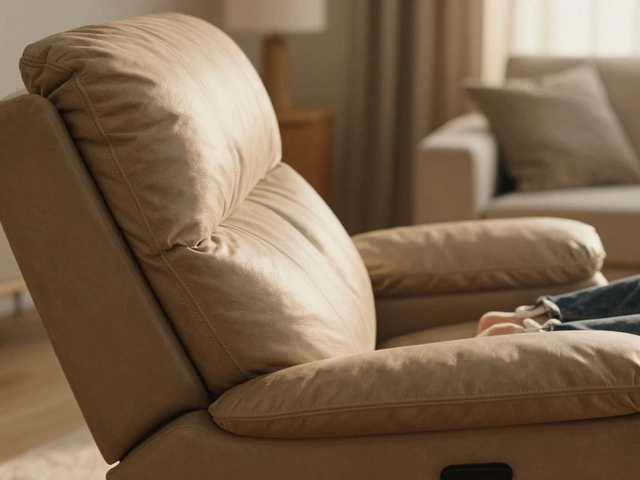
Black: Bold, But Not Brash
Black furniture gets a bad rap. People think it’s too harsh, too dramatic, too much. But used right, it’s one of the most versatile colors you can own. Think of black not as a color that dominates, but as a frame. Like a black picture frame around a photo, black furniture defines space and adds structure.
Use it for accent pieces: a black coffee table, a sleek media console, or a pair of armchairs. Black metal legs on a white sofa? Instant contrast. Black wooden side tables in a bright white room? Grounded and intentional. Black doesn’t need to be everywhere-it just needs to be intentional. And when you pair it with wood tones, brass accents, or even pastels, it becomes the anchor that holds the whole room together.
Pro tip: Avoid glossy black unless you’re going for a retro 1980s look. Matte or satin finishes are more forgiving and feel more modern. Also, black absorbs heat. If your room gets direct sunlight, a black leather sofa might get uncomfortably warm.
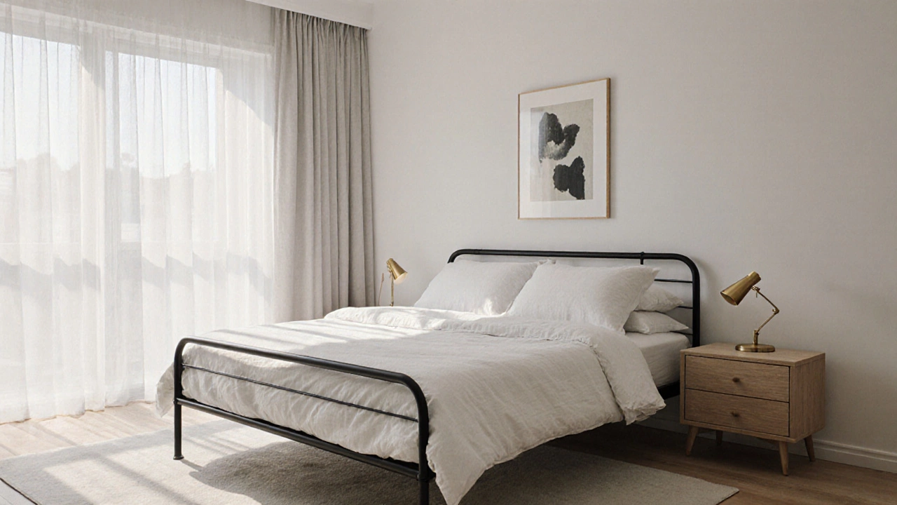
Natural Wood Tones: The Warm Neutral
Wood isn’t a color-it’s a category. And within that category, there are only a few tones that truly go with everything. Stick to light oak, walnut, and ash. These are the neutral wood tones that work in modern, traditional, rustic, and even industrial spaces.
Light oak has a clean, airy feel. It’s what you see in Scandinavian homes and Japanese interiors. Walnut is richer, with deep brown undertones that add warmth without being heavy. Ash is the middle ground-pale, slightly grayish, and super adaptable.
A walnut dining table works with white walls, gray chairs, and green plants. A light oak bookshelf looks at home beside a navy sofa or a bright yellow accent wall. Wood doesn’t just blend-it adds texture and depth. And unlike painted furniture, wood ages gracefully. Scratches, dents, and fading only make it more characterful.
Why These Four Colors Work Every Time
White, gray, black, and natural wood aren’t random picks. They’re the foundation colors of design. They exist in nature. They’re in every high-end hotel lobby, every designer showroom, every magazine spread. Why? Because they’re not trends-they’re constants.
Here’s the rule: if you can’t find a color that goes with your walls, your floor, and your lighting, you’re probably looking at a color that’s too saturated, too bright, or too cold. These four colors don’t have a personality of their own. They’re the quiet listeners in a room full of talkers. They let your personality shine.
Also, they’re easy to update. Swap out your throw pillows, curtains, or artwork, and your furniture still looks intentional. No need to replace the sofa every time a new trend hits Instagram.
What to Avoid
Not all neutrals are created equal. Stay away from:
- Beige that looks like cardboard-too yellow, too dull
- Dark brown furniture that feels like a 1990s family room
- Pastel furniture (mint, lavender, peach)-these are trends, not foundations
- High-gloss finishes in bright colors-too reflective, too loud
These colors don’t fail because they’re ugly. They fail because they’re too specific. They lock you into a style. And styles change. Furniture lasts for decades.
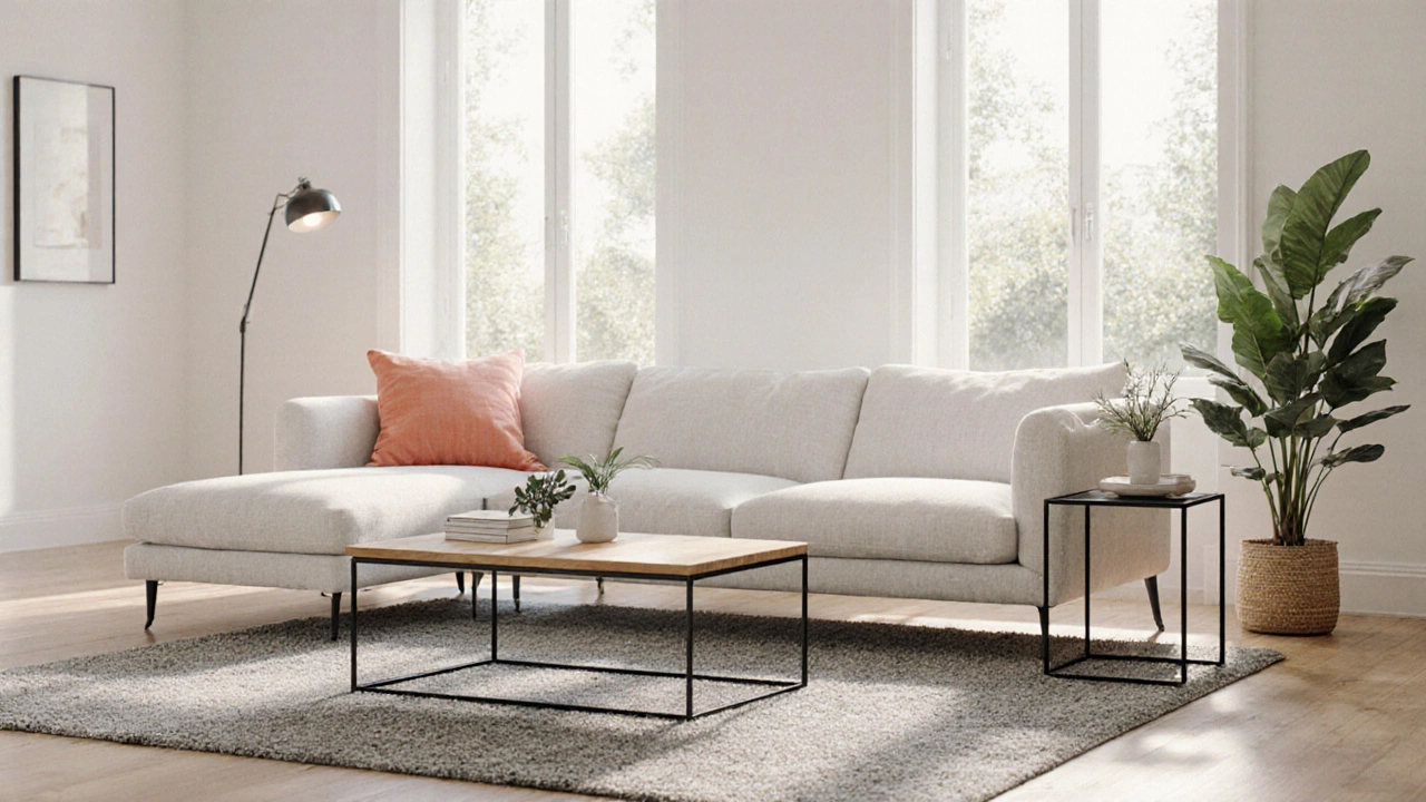
Real-Life Examples
Take a Vancouver condo with floor-to-ceiling windows and gray concrete floors. The owner chose a white linen sofa, a walnut coffee table, and a black metal side table. The walls are white. The rug is a soft gray wool. The only color comes from a few green plants and a single coral pillow. It feels calm, modern, and timeless. No one would guess it was done in 2023-or 2025.
Or a family home in a suburb with dark hardwood floors and yellow-tinted windows. They picked a charcoal gray sectional, a light oak TV stand, and white side tables. The result? A space that feels cozy, not dark. The gray absorbs the yellow light without amplifying it. The wood adds warmth. The white keeps it airy.
How to Test Before You Buy
Don’t just grab a chair at the store and assume it’ll work. Bring home samples. Order fabric swatches. Hold them up against your walls, your rug, your curtains, and your lighting at different times of day. Natural light changes everything. A gray that looks perfect in the afternoon might look blue under LED lights at night.
Also, think about your lifestyle. If you have kids or pets, avoid white fabric unless it’s performance-grade. If you love texture, mix materials: a velvet gray chair, a woven wood side table, a linen white sofa. Texture keeps neutrals from feeling flat.
Final Rule: Less Is More
The secret isn’t finding the perfect color. It’s finding the right number of colors. Most homes have too many competing elements. Pick one or two neutral furniture pieces as your base. Then build your personality around them with accessories. That’s how you get a space that feels curated-not cluttered.
White, gray, black, and natural wood don’t solve every design problem. But they solve the biggest one: the fear of making a mistake. Choose one of these, and you’re not betting on a trend. You’re betting on time.
Can white furniture work in a dark room?
Yes, absolutely. White furniture reflects available light, making a dark room feel more open and less closed-in. Pair it with mirrors, glossy surfaces, and layered lighting (floor lamps, table lamps) to bounce light around. Avoid pure white if your room has no natural light-opt for cream or off-white instead, which feels warmer and less clinical.
Is gray furniture too cold for a cozy home?
Not if you balance it. Gray can feel cool, but so can stone or metal. Add warmth with wood accents, wool rugs, textured throws, and warm-toned lighting. A gray sofa with a brown leather ottoman and amber floor lamps feels inviting, not sterile. The key is mixing materials, not just colors.
Should I match my furniture color to my floors?
No, and you shouldn’t try to. Matching floors and furniture creates a flat, boring look. Instead, contrast them. Light floors with dark furniture, or dark floors with light furniture. This creates depth and dimension. For example, white furniture on dark walnut floors looks intentional and modern. The contrast is what makes it interesting.
What’s the best neutral for small spaces?
White. It’s the most effective at making a small space feel larger because it reflects light and doesn’t visually weigh things down. If you want more warmth, go for a light oak coffee table or a beige rug. But keep the main furniture pieces white or very light gray. Avoid dark colors on large pieces like sofas or dressers-they’ll make the room feel smaller.
Can I mix different wood tones?
Yes, and you should. Mixing wood tones adds depth and avoids a museum-like look. Just keep them in the same family-light oak with walnut is fine. Avoid pairing very dark mahogany with very pale pine unless you’re going for a very specific, eclectic style. Stick to two or three wood tones max, and let one dominate.
Next Steps
If you’re shopping for new furniture, start by identifying the color of your walls, floor, and largest window treatment. Then pick one of the four neutral furniture colors that contrasts or complements it. Don’t rush. Take your time. Test samples. Live with them for a few days before buying.
And remember: furniture isn’t about being trendy. It’s about being timeless. The pieces you buy today should still feel right five, ten, even twenty years from now. That’s why the best color for furniture isn’t the one everyone’s posting online-it’s the one that lets you change your mind without changing your sofa.