Ever noticed how a sofa can totally change the game in a room—sometimes making it feel cramped, sometimes giving it new breathing space? It’s wild how just plopping down the right piece, in the right color, suddenly makes walls recede and windows feel huge. I’ve seen friends pick chunky brown sectionals and, boom, their living rooms look like shoeboxes. But when Cassandra wanted a fresh look for our own place, she was obsessed with opening things up. That sent me down a rabbit hole of color charts, wild design blogs, and some very heated debates with Rocky (who, as a dog, only cares about which parts are best for naps).
The Science: Why Color Tricks the Eye
Let’s start with a big fact: color is a total illusionist. What you put in the center of your living room doesn’t just sit there—it changes how the entire space feels. The National Association of Home Builders found that people perceive lighter rooms as up to 20% bigger than they actually are. Moving big, dark furniture right in can shrink your sense of space faster than a magic trick. So why do pale colors add that airiness? It all comes down to how light bounces. Lighter shades grab natural light and scatter it—reflecting it around the room. That extra bounce means your eyes can’t find harsh borders, so the space feels continuous and open.
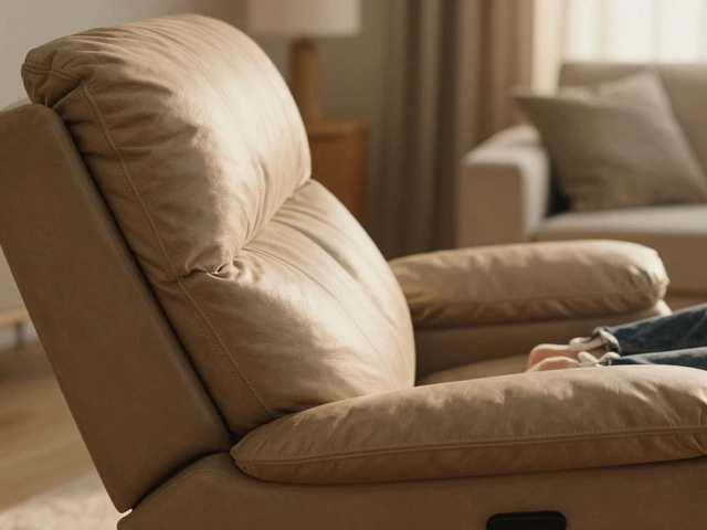
On the technical side, think about how artists paint backgrounds to push things away from the viewer. Lighter colors recede, while dark ones pop out and feel closer. A sofa in a pale gray, beige, or classic off-white just kind of melts into the room, refusing to hog all the attention. It joins the team instead of acting as the demanding captain. If you want science, just look at daylight reflectance values, or LRVs. Colors with higher LRVs (think 70-90%) reflect more light. So yes, it’s not a myth—those off-white sofas are the secret weapon for breathing room.
Best Color Choices for Making a Room Look Bigger
Let’s cut to the chase—which colors actually work? Here’s a toolbox that even a stubborn spouse can’t argue with (I’m looking at you, Cassandra):
- Light Gray: Not the cold, clinical gray you see in waiting rooms, but those soft dove or warm greige tones. They play nice with any wall color, and they don’t attract dust or pet hair (Rocky would call that a win).
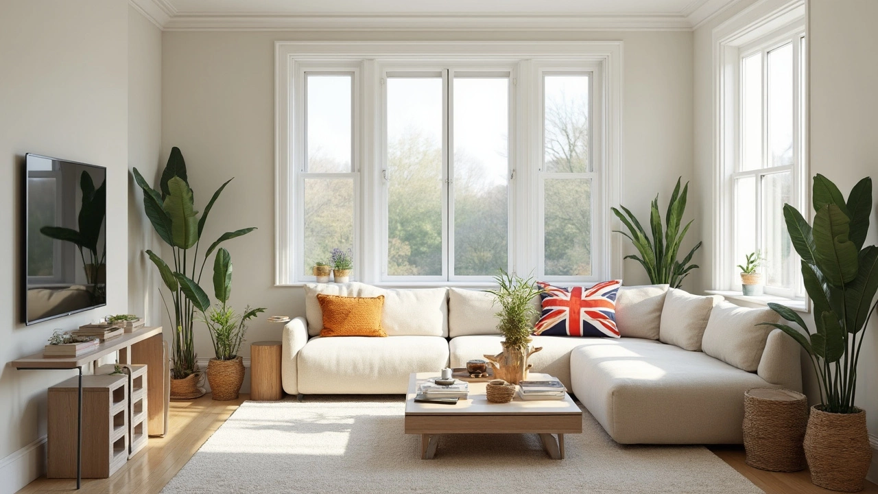
- Cream or Off-White: Softer than stark white, these shades feel homey, not hospital. They still bounce light and blend seamlessly with Scandinavian, minimal, or boho styles.
- Pale Blue: Blue always calms things down—but a hint of sky blue gives just enough color to avoid boredom, while still opening up your space.
- Soft Taupe or Sand: Neutral without being boring. Earthy, sandy shades echo nature and help walls seem like they’re drifting away.
- Pastels: If you crave color, look for powdery blush pinks or mint. They’ll give you personality without eating up visual space.
There’s a reason why nearly every modern show-home features a pale or neutral sofa smack in the middle. Even real-estate agents pull this trick—data from the Zillow Paint Colors Analysis shows homes with lighter, neutral living rooms can sell for up to $1,500 more than average, all because buyers feel more space, not less.
Styling Tips: How to Maximize the Airy Effect
Picking the right color is just the start. Want your sofa and room combo to really slay the illusion of space? This is where styling comes in. Start with your floor plan. Don’t jam your sofa against the wall—leaving a slim gap, even three inches, tricks the eye into seeing more space behind. Next up, go low-profile. A sofa with exposed legs and no bulky skirt lets more light pass underneath, giving your floors the spotlight they deserve. Glass or light wood coffee tables amplify that effect. Steer clear of heavy, dark fabrics. Velvet in navy or olive is gorgeous but makes the sofa pop forward, cramping the vibe.
Layering lighter fabrics—think cotton or linen throws—adds texture without heaviness. Play with a monochromatic color scheme across the room. When your sofa’s color echoes your walls or curtains in a similar tint, the borders blur, and the brain can’t find the end of one thing and the beginning of another. The trick works especially well if you keep big decor items—like area rugs and shelving—close in tone to your sofa. Even your pets can get in on the act. Our dog Rocky blends right in on light wood floors, which, for him, means prime nap spots on sunny days.
| Color | Light Reflectance Value (LRV) | Personality in Room |
|---|---|---|
| Soft Gray | 65-75 | Modern, Clean |
| Off-White | 82-90 | Bright, Fresh |
| Pale Blue | 70-80 | Calm, Spacious |
| Sand/Taupe | 60-70 | Natural, Welcoming |
| Pastel Pink | 71-78 | Soft, Playful |
Larger mirrors on the wall opposite the sofa also help by doubling the sense of depth, and sheer curtains let more sunlight filter onto those reflective cushions. Another smart move: scale your pillows down. Toss two streamlined cushions instead of a mountain of puffy ones that crowd the seat. Plants bring vertical accent (and distract from room edges), so tuck a tall palm or snake plant nearby to draw eyes up—not sideways.
Common Missteps and Creative Solutions
It’s so easy to fall in love with a bold fabric or a trendy color—until you sit down and realize your living room now feels like a storage closet. The biggest mistake? Going for patterns that are too loud or choosing upholstery in deep charcoal, burgundy, or forest green for a small room. Sure, these colors hide stains (handy if you have pets like Rocky), but they dominate, making everything feel hemmed in.
Another common snag: putting a dark sofa in front of a light wall, thinking you’ll get contrast. What you really end up with is a visual break that makes the room feel divided, not unified. Matching your sofa roughly to your wall color, just with subtle shade differences, actually pulls the eye along without stops. If stains are your top worry, pick performance fabrics in high-LRV colors rather than resorting to dark tones. There are new stain-resistant microfiber and slipcovers that handle mud, ice cream, dog hair—you name it.
Want to break up all that pale fabric without shrinking the space? Try combining textures—leather, boucle, linen. Accent with metal or glass side tables, keeping the lines slim and open. Go wild with artwork, but hang it high to keep energy lifted instead of grounded. If you must have your favorite bold color, tuck it into accent pieces—vases, throws, or one wild patterned chair.
Here’s one last tip: lighting matters just as much as color. Warm LED bulbs bounced off the sofa bring out creamy undertones and keep things cozy, not cold. Cassandra swears by her habit of lighting candles on the window sill, bouncing soft golden hues onto our pale gray sofa at night. She’s onto something—our space has never felt so big, even when it’s packed for movie night with half the neighborhood squeezed in (and Rocky hogging his cushion in the center). It’s all about using color and clever tricks to make every inch count.