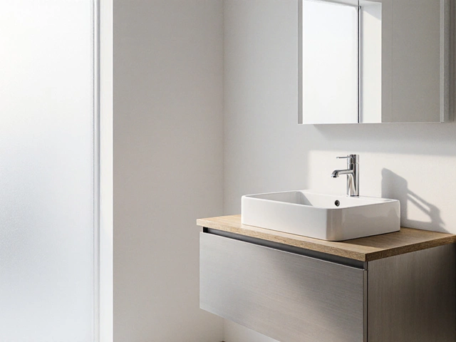
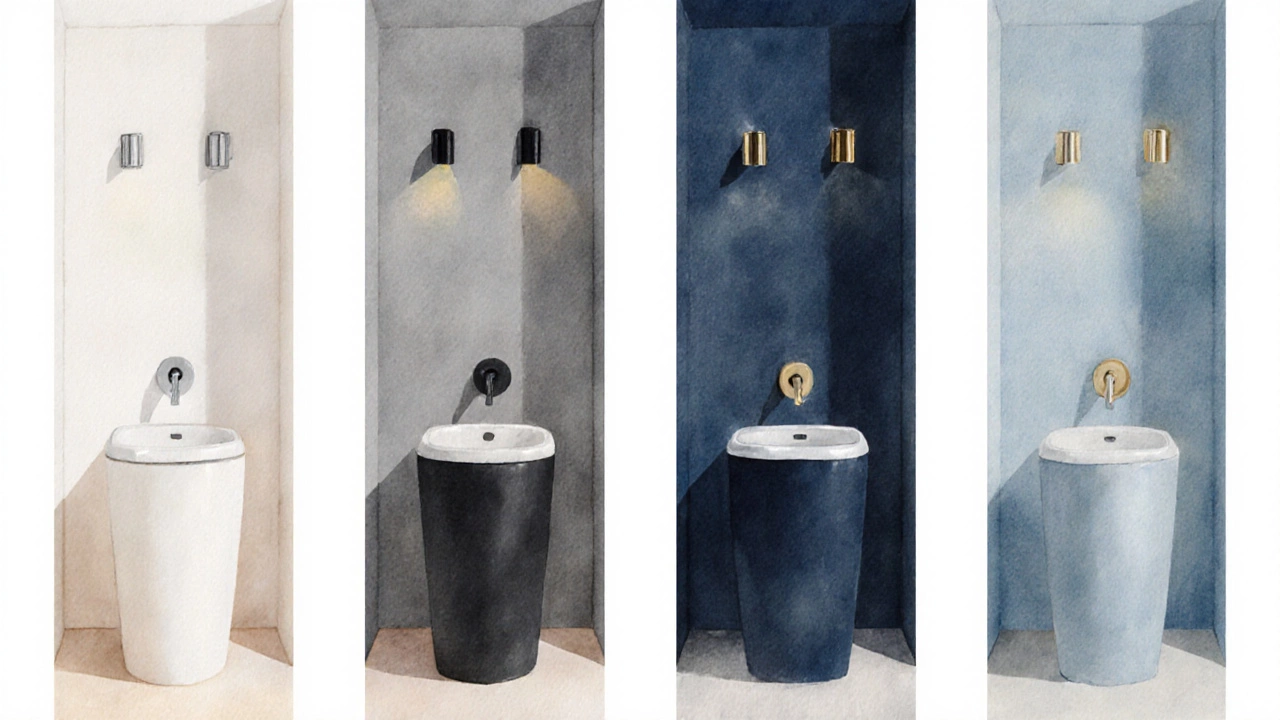
Timeless Bathroom Color Selector
Recommended Color:
Typical Use Case:
| Color | Mood & Feel | Light Reflection | Best Fixture Finish | Typical Use Cases |
|---|---|---|---|---|
| White | Clean, spacious | High – maximizes brightness | Chrome, brushed nickel | Small bathrooms, modern minimalism |
| Gray | Neutral, sophisticated | Medium – softens harsh light | Matte black, oil-rubbed bronze | Industrial or loft-style spaces |
| Beige | Warm, inviting | Medium – reflects gently | Brass, aged copper | Traditional, farmhouse, coastal |
| Navy | Rich, luxurious | Low – absorbs light, needs accent lighting | Polished brass, gold | Master baths, statement walls |
| Soft Blue | Calm, airy | High – brightens with natural light | Chrome, matte black | Family bathrooms, spa-like retreats |
If you’re hunting for timeless bathroom colors, you’re not alone. Homeowners want a look that feels fresh year after year without a costly repaint every few seasons.
Key Takeaways
- Neutral palettes-white, gray, beige-stay fresh longer than bold trends.
- Deep navy or soft blue add character while still feeling classic.
- Finish matters: matte or satin paint hides water spots better than glossy.
- Pair colors with the right fixtures, lighting, and flooring for a cohesive look.
- A simple comparison table can help you pick the hue that matches your space.
What Makes a Color "Timeless"?
When we talk about a bathroom color the paint or finish applied to walls, ceilings, and sometimes fixtures in a bathroom, we’re looking at three main qualities:
- Versatility - The hue works with multiple styles, from mid‑century modern to contemporary farmhouse.
- Adaptability to Light - It stays inviting whether the bathroom gets natural daylight or relies on artificial fixtures.
- Low Maintenance Appearance - It hides water marks and minor scuffs better than high‑contrast shades.
Colors that hit all three spots tend to dominate design magazines for years. Below are the most reliable choices.
Top Timeless Bathroom Colors
1. Classic White
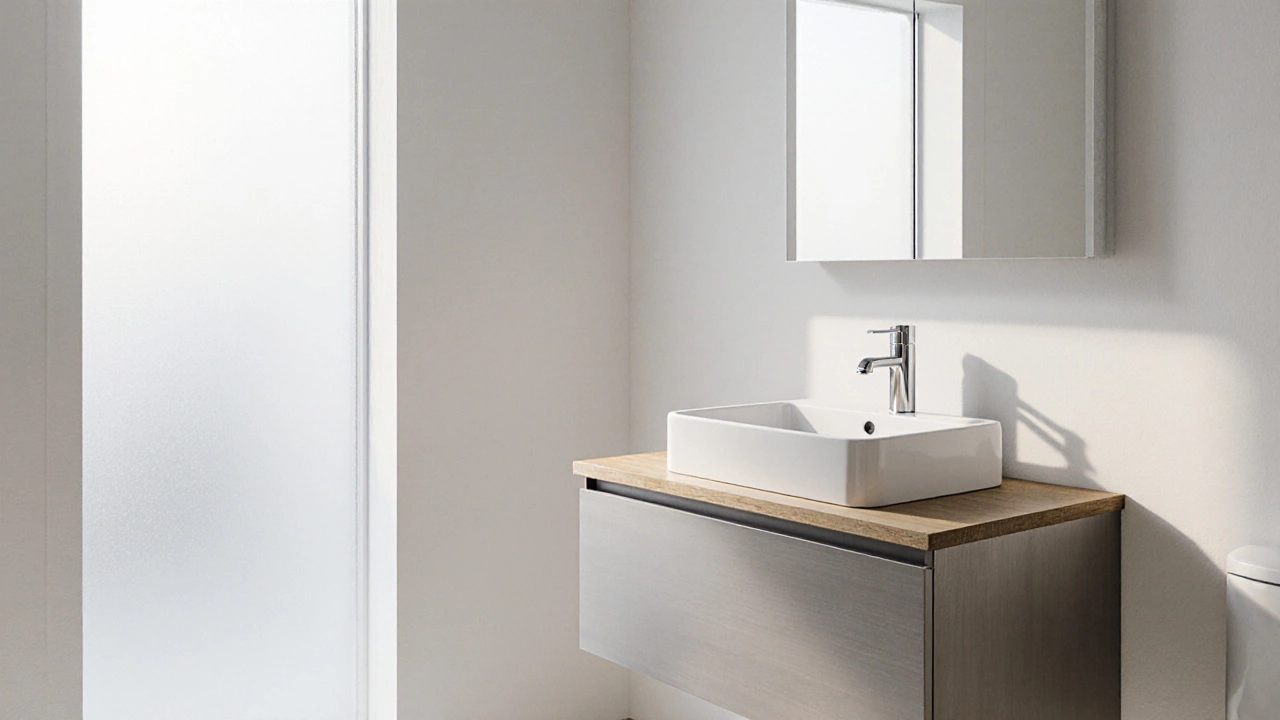
White a bright, neutral shade that reflects natural and artificial light feels clean, spacious, and instantly modern. Pair it with brushed nickel hardware for a sleek look, or add wood accents for warmth.
2. Soft Gray
Gray a muted neutral that ranges from light silver to deep charcoal provides depth without overwhelming a small room. Light gray walls combined with white fixtures create a subtle contrast that ages gracefully.
3. Warm Beige
Beige a gentle earth tone that adds a hint of warmth works especially well in homes with natural wood cabinetry. It coordinates easily with both chrome and bronze finishes.
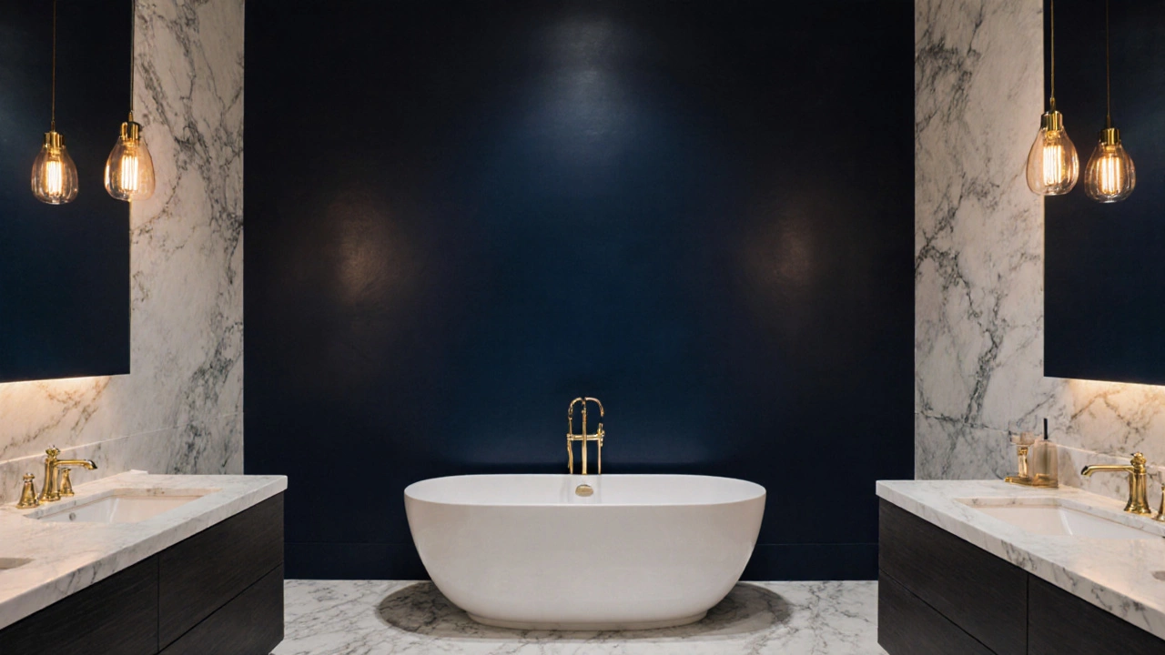
4. Deep Navy
Navy a dark, saturated blue that feels luxurious yet timeless is perfect for accent walls or a full‑color approach in larger bathrooms. Pair with brass or gold hardware to boost the regal feel.
5. Soft Blue (Sky or Powder)
Soft blue a pastel hue reminiscent of clear skies offers a calming vibe while staying neutral enough for long‑term appeal. Works great with white tiles and matte black accents.
How to Pair Fixtures, Flooring, and Lighting
Choosing a color is only half the battle. The right combination of fixtures, flooring, and light makes the hue shine.
- Hardware finishes: White walls love chrome or brushed nickel; deep navy pairs nicely with polished brass or oil‑rubbed bronze.
- Flooring: Light gray or beige walls complement natural stone or porcelain tiles with subtle veining. For navy, consider a light‑colored marble to break up the darkness.
- Lighting: Warm LEDs (3000‑3500K) enhance beige and soft blue, while cooler LEDs (4000‑5000K) keep whites and grays crisp.
Practical Tips for a Long‑Lasting Finish
Even the most timeless hue can look dated if the finish isn’t right. Here are the go‑to options:
- Paint finish the sheen level of wall paint, ranging from flat to high‑gloss: Choose satin or low‑sheen for bathrooms. They resist moisture and hide fingerprints better than a high‑gloss finish.
- Ventilation: Proper exhaust fans reduce humidity, preventing paint from peeling regardless of color.
- Primer: Use a mold‑resistant primer on walls that have previously suffered water damage.
Common Pitfalls to Avoid
Even seasoned DIYers can slip up. Watch out for these mistakes:
- Choosing a shade that’s too dark for a small bathroom - it can make the space feel cramped.
- Using a glossy finish on a high‑traffic wall - it will show water spots instantly.
- Neglecting to test paint samples in different lighting conditions - a color can shift dramatically under morning vs. evening light.
Comparison of Timeless Bathroom Colors
| Color | Mood & Feel | Light Reflection | Best Fixture Finish | Typical Use Cases |
|---|---|---|---|---|
| White | Clean, spacious | High - maximizes brightness | Chrome, brushed nickel | Small bathrooms, modern minimalism |
| Gray | Neutral, sophisticated | Medium - softens harsh light | Matte black, oil‑rubbed bronze | Industrial or loft‑style spaces |
| Beige | Warm, inviting | Medium - reflects gently | Brass, aged copper | Traditional, farmhouse, coastal |
| Navy | Rich, luxurious | Low - absorbs light, needs accent lighting | Polished brass, gold | Master baths, statement walls |
| Soft Blue | Calm, airy | High - brightens with natural light | Chrome, matte black | Family bathrooms, spa‑like retreats |
Frequently Asked Questions
Can I use a bold color like navy in a tiny bathroom?
Yes, but treat it as an accent wall rather than a full‑room paint. Pair with plenty of white or light gray fixtures and add layered lighting to keep the space from feeling closed in.
Which paint finish works best for high‑humidity bathrooms?
A satin or low‑sheen (sometimes called eggshell) finish offers the right balance of moisture resistance and ease of cleaning without the glare of a high‑gloss paint.
How often should I repaint my bathroom?
With a quality satin finish and proper ventilation, most timeless colors last 7‑10 years before a touch‑up is needed.
Is white really the safest choice for resale?
Yes. White appeals to the broadest range of buyers and helps potential owners envision their own décor without the need for immediate repainting.
Should I coordinate the wall color with my tile?
Ideally, the wall hue should complement rather than match the tile. For example, a soft gray wall works beautifully with white subway tile, while beige walls pair well with patterned terra‑cotta tiles.