Bathroom Paint Color Ideas: Find the Perfect Hue for Your Space
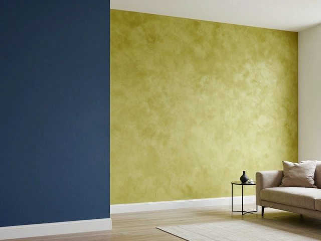
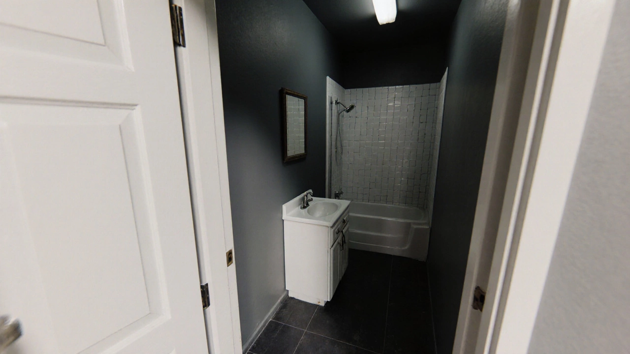
When working with bathroom paint color, the specific shade or palette used on bathroom walls and ceilings to set mood, enhance space, and resist moisture. Also known as bathroom wall color, it plays a key role in how light interacts with fixtures and how the room feels overall. Pairing it with Neutral bathroom paint, soft, unobtrusive shades like whites, beiges, and light greys that create a calm backdrop is a safe bet for small or bright spaces, while Classic bathroom color schemes, timeless combinations such as navy‑blue with white trim or charcoal with gold accents add depth and a touch of luxury. The right Bathroom lighting, fixture type, placement, and colour temperature that influence how paint appears can make a muted tone pop or a bold hue feel softer. Finally, consider Bathroom wallpaper, water‑resistant patterned or textured wallcoverings that complement paint and add visual interest. Together these elements create a cohesive look: bathroom paint color encompasses style choices, requires proper lighting, and influences decoration accessories like wallpaper and fixtures.
How Trends and Timeless Choices Shape Your Bathroom Palette
Recent years have seen a swing from stark white walls to richer, nature‑inspired palettes. Designers now favour earthy neutrals—taupe, warm greys, and soft sage—that work well with both modern fixtures and vintage tiles. These tones are a direct evolution of classic bathroom colour schemes, showing how history informs current taste. When you add a splash of colour through an accent wall or a patterned wallpaper, the overall impact depends on the base paint. For example, a muted teal paint pairs beautifully with a subtle, water‑resistant botanical wallpaper, while a deep charcoal works best with metallic accents and bright LED lighting. In every case, the choice of bathroom lighting dictates whether a colour looks vibrant or subdued, so choose bulbs with a colour temperature around 3000‑3500K for warm, inviting spaces, or 5000K for crisp, contemporary looks. By understanding how each element interacts, you can avoid the common mistake of picking a paint that clashes with existing tiles or hardware.
Now that you see how paint, light, wallpaper, and classic colour schemes fit together, you’re ready to explore the articles below. They dive deeper into specific colour ideas, budget‑friendly makeover tricks, and the latest trends that can help you turn any bathroom—no matter how dated—into a refreshed, stylish oasis.
Best Paint Colors to Make a Small Bathroom Look Bigger
Discover the top paint colors and simple tricks that instantly make a small bathroom feel larger, brighter, and more open.
full article