Bathroom Paint Color Visualizer
Visualized Results
Reflectivity Score:
Perceived Space Impact
Recommended Complementary Fixtures
Mood Effect
Ever stepped into a cramped bathroom and felt the walls closing in? The good news is you don’t need to rip out tiles or expand the floor plan to gain space. A smart choice of paint colors can trick the eye, brighten the room, and make it feel noticeably larger.
How Color Influences Our Perception of Space
Bathroom is a functional room where lighting, moisture, and fixtures intersect. It often feels smaller because walls are close together and mirrors are limited. When you paint the walls, you’re literally painting the canvas that your brain uses to judge depth. Light, reflective hues bounce natural and artificial light around, creating an illusion of extra square footage.
Research from the University of Alberta’s visual perception lab shows that rooms painted in high‑reflectance shades can appear up to 15% larger than identical rooms in darker tones. The trick works because light colors reduce visual contrast between the walls and the ceiling, flattening the visual field and allowing the eye to wander farther.
Top Light Colors That Expand Your Bathroom
Below are the most effective paint hues, along with why they work and how to pair them with common fixtures.
| Color | Reflectivity Score (0‑10) | Best Mood | Ideal Complementary Fixtures |
|---|---|---|---|
| Pure White A true, neutral white with no undertones | 9 | Clean, Spa‑like | Chrome fixtures, glass shower doors |
| Soft Gray A light, cool gray that still feels airy | 7 | Modern, Calming | Matte black hardware, white tiles |
| Pale Blue A whisper of sky blue that adds subtle color | 6 | Fresh, Relaxing | Brushed nickel, white subway tile |
| Seafoam Green A muted teal‑green that feels breezy | 6 | Natural, Invigorating | Wood accents, light gray grout |
| Warm Beige A soft, creamy beige with a hint of warmth | 5 | Cozy, Inviting | Brass fixtures, textured tiles |
Why these shades? They sit in the high‑reflectivity range (6‑9) while staying neutral enough to pair with any countertop or tile. Pure white tops the list because it reflects the most light, but a slight undertone-like soft gray or pale blue-adds personality without sacrificing brightness.
How to Pair Paint with Tiles, Fixtures, and Accessories
Once you’ve chosen a hue, think about the other visual elements that share the wall’s surface area.
- Tile color: Light‑colored subway or marble‑look tiles keep the floor from anchoring the space. If you love pattern, opt for small, repeat‑size mosaics that don’t overwhelm the wall color.
- Fixture finish: Chrome or brushed nickel stay in the reflective family, reinforcing the light‑bounce effect. Brass works well with warm beige, but avoid matte finishes that can deaden the shine.
- Accent pieces: Add a pop of color with towels or a vanity rug, but keep the primary palette light. One bright accent (e.g., navy soap dispenser) creates focus without shrinking the room.
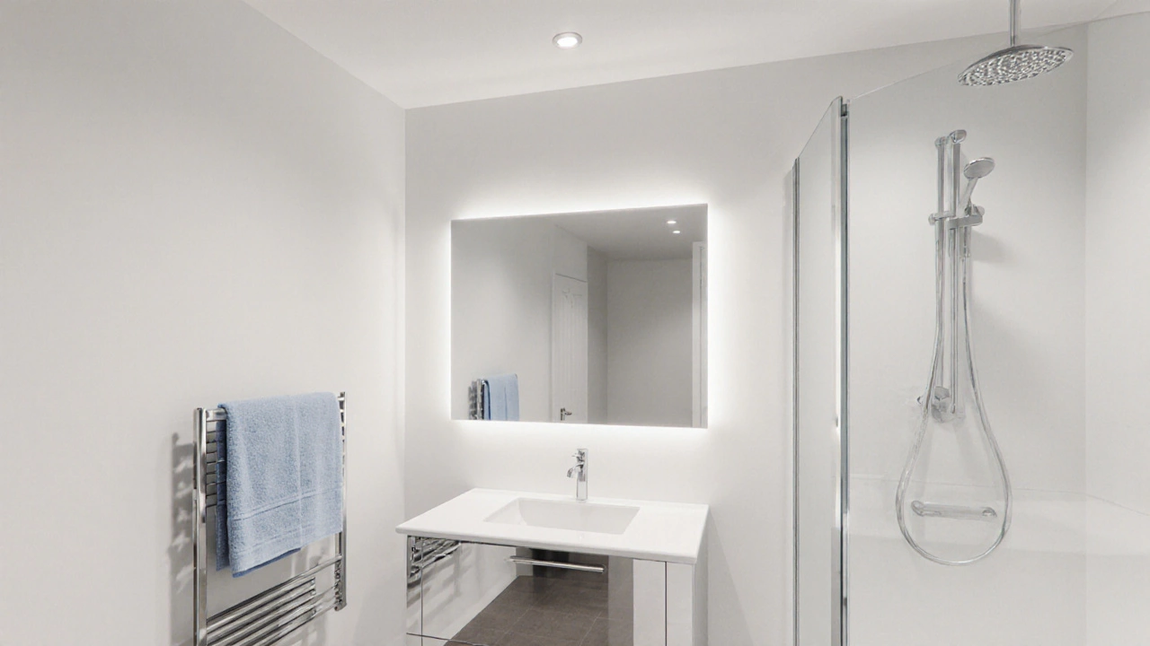
Lighting & Mirror Strategies That Amplify Color
Even the best paint fizzles out if the lighting is poor. Here’s how to layer illumination:
- Ambient ceiling lights: Install LED recessed fixtures with a high CRI (Color Rendering Index) of 90+ to ensure colors appear true.
- Task lighting: Place a vanity light on either side of the mirror to eliminate shadows and highlight the wall hue.
- Accent lighting: Strip lights under cabinets or behind a glass shelf add a soft glow that reflects off the walls.
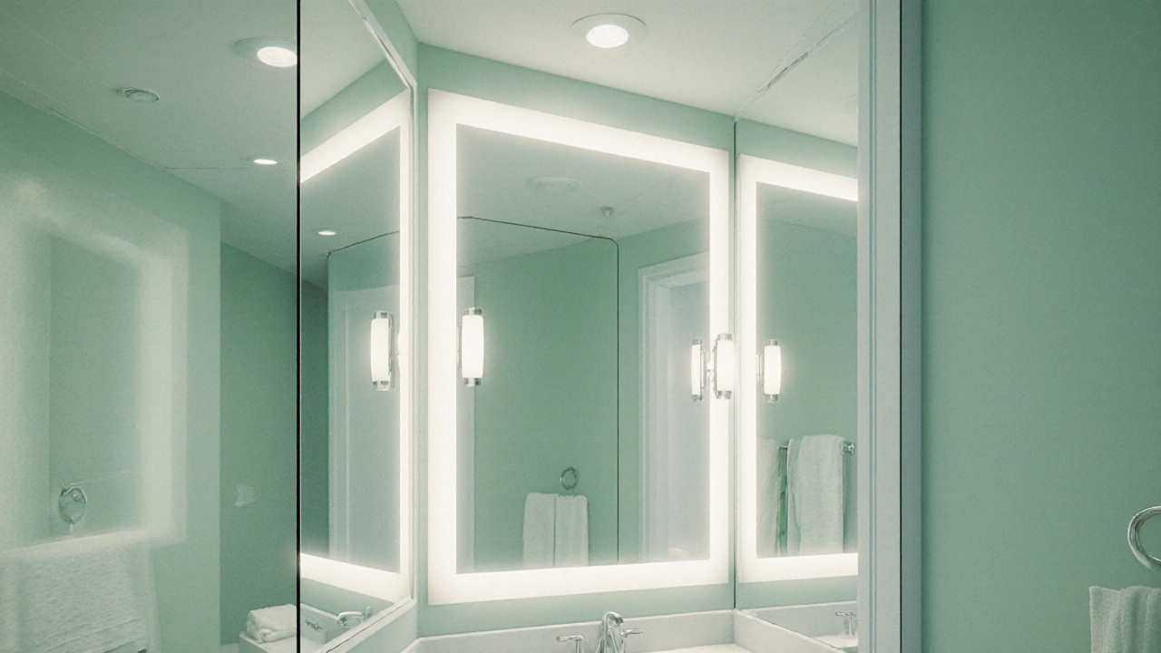
Mirrors are the unsung heroes. A full‑length mirror that stretches from floor to ceiling doubles the visible surface area, effectively reflecting the paint and making the room feel deeper. If floor‑to‑ceiling isn’t possible, choose a mirror that aligns with the wall’s midpoint-your eye will naturally follow the reflection outward.
Common Pitfalls and How to Dodge Them
Choosing the wrong shade or finishing technique can backfire.
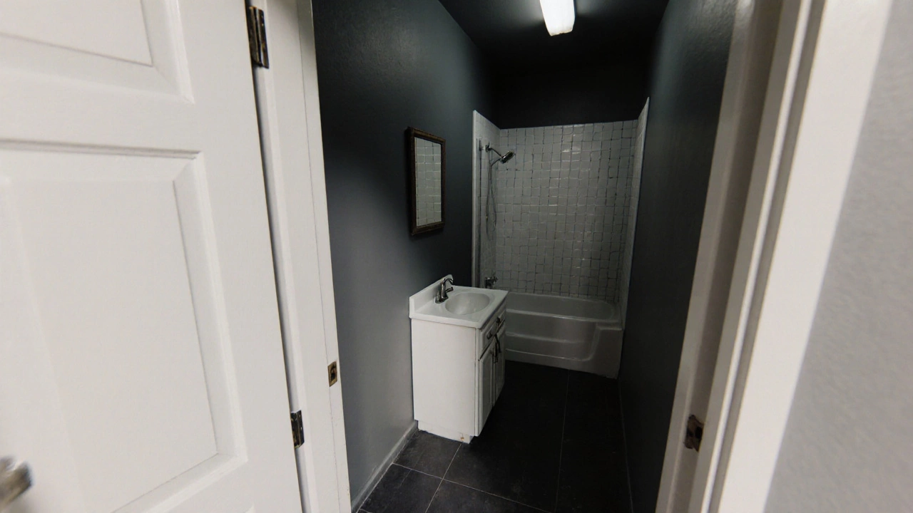
- Too much contrast: A dark vanity against a light wall creates a visual breakpoint that slices the space. Keep contrast subtle-think light wood or pastel fixtures.
- Glossy paint in humid spots: High‑gloss finishes can highlight water spots and mildew. Stick with matte or satin finishes for walls, reserving gloss for trim.
- Over‑saturation: Even a soft pastel can feel oppressive if the bathroom lacks natural light. Pair strong hues with a generous amount of artificial lighting.
Quick Checklist Before You Paint
- Test paint samples on two opposite walls; observe at morning, noon, and evening light.
- Choose a satin finish for walls; use semi‑gloss for trim.
- Upgrade lighting to at least 1,200 lumens total for a 5×8ft bathroom.
- Install a mirror that covers at least 30% of the wall area.
- Pick fixtures that reflect light-chrome, nickel, or polished brass.
Frequently Asked Questions
Can I use bold colors like navy or black in a small bathroom?
Bold colors work when you limit them to an accent wall or vanity. The surrounding walls should stay light to preserve the spacious feel. Pair a navy accent with plenty of mirrors and bright lighting to avoid a cave‑like vibe.
Is pure white too sterile for a bathroom?
Pure white can feel clinical, but you can soften it with warm‑tone accessories, wooden shelves, or a plush towel set. The key is balancing the clean backdrop with texture.
Should I paint the ceiling the same color as the walls?
Painting the ceiling the same light shade extends vertical lines, making the room feel taller. If the ceiling is already bright white, keep it that way; otherwise, a one‑shade‑lighter version of your wall color works well.
How many coats of paint do I need for a moisture‑prone bathroom?
Two coats of a high‑quality, mold‑resistant paint are recommended. Let each coat dry for at least 24hours before applying the next.
Do I need a primer before painting a bathroom?
If you’re switching from a dark to a light color, a stain‑blocking primer prevents bleed‑through. For light‑on‑light jobs, a mildew‑resistant primer adds an extra layer of protection against humidity.