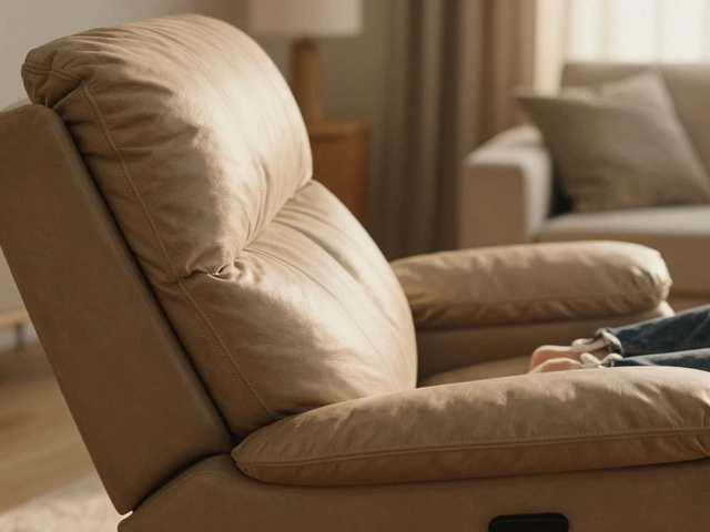
Accent Wall Style Visualizer
Design Analysis:
Choose a design approach from the options to see how it transforms the space and why it works (or doesn't).
Choose Your Approach
You've probably noticed that the single, bright red wall in the living room-the one that was practically mandatory in 2010-doesn't show up in modern design magazines anymore. It makes you wonder: did we all just wake up one day and decide that one loud wall was a mistake? The short answer is that the accent walls we grew up with are definitely out, but the idea of creating a focal point is more alive than ever. It's not about whether they're 'out of style,' but how the definition of an accent has shifted from a simple paint color to something much more tactile and integrated.
For those scratching their heads, Accent Walls are interior design elements where one wall in a room is visually distinguished from the others through a different color, material, or texture. While the old-school approach was just to grab a can of contrasting paint, today's look is about depth, architecture, and intent.
Quick Takeaways: The New Rules of Wall Design
- Ditch the 'Single Paint Color' Look: Painting one wall a random bold color without a reason feels dated.
- Texture is King: Wood slats, plaster, and stone have replaced flat paint.
- Color Drenching: The trend is moving toward painting the whole room (including trim) in one cohesive hue.
- Zoning: Use accents to define a space (like a reading nook) rather than just filling a wall.
Why the Old Way Stopped Working
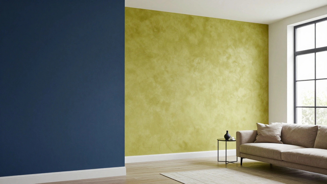
Remember the 'feature wall' craze? It was easy. You'd pick a neutral beige for three walls and a deep navy for the fourth. The problem was that it often looked like a mistake or a halfway-finished paint job. It chopped the room in half and created a harsh visual break that didn't actually serve the architecture of the house.
Modern homes, especially those with open-concept layouts, struggle with this. When your kitchen, dining, and living areas are all one giant room, a single painted wall can look random. Why is that one wall blue when the rest of the 'zone' is white? It lacks a logical anchor. Design has moved toward a more holistic approach where the entire environment feels intentional.
The Rise of Texture and Materiality
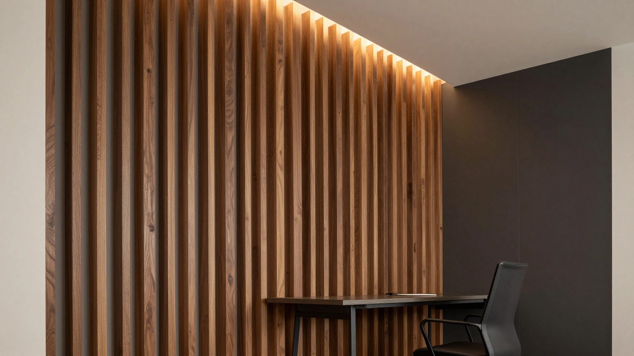
If you want a focal point in 2024 and 2025, stop looking at paint swatches and start looking at materials. We've seen a massive shift toward Wall Paneling, which is the application of decorative wooden or composite boards to a wall to create architectural interest. Instead of a color, the 'accent' is now the shadow and depth created by the material.
Take Slat Walls, for example. These are thin vertical strips of wood (often oak or walnut) mounted with small gaps between them. They don't just look modern; they provide acoustic dampening, which is a huge win for those of us living in noisy urban environments. It's a functional accent. If you're in a home with high ceilings, these vertical lines draw the eye upward, making the room feel even taller.
Then there's the organic look. Lime Wash is a natural paint made from calcium hydroxide and water that creates a mottled, suede-like texture. It doesn't look like a flat coat of paint; it looks like a Mediterranean villa. It adds a soft, cloudy movement to the wall that feels sophisticated rather than loud.
| Feature | The 'Dated' Way | The 'Modern' Way |
|---|---|---|
| Method | Single bold paint color | Texture, materials, or tonal shifts |
| Visual Effect | High contrast, flat surface | Depth, layering, organic feel |
| Purpose | Fill a blank wall | Define a zone or add architectural value |
| Examples | Red wall in a beige room | Walnut slats, Lime wash, Fluted panels |
The 'Color Drenching' Phenomenon
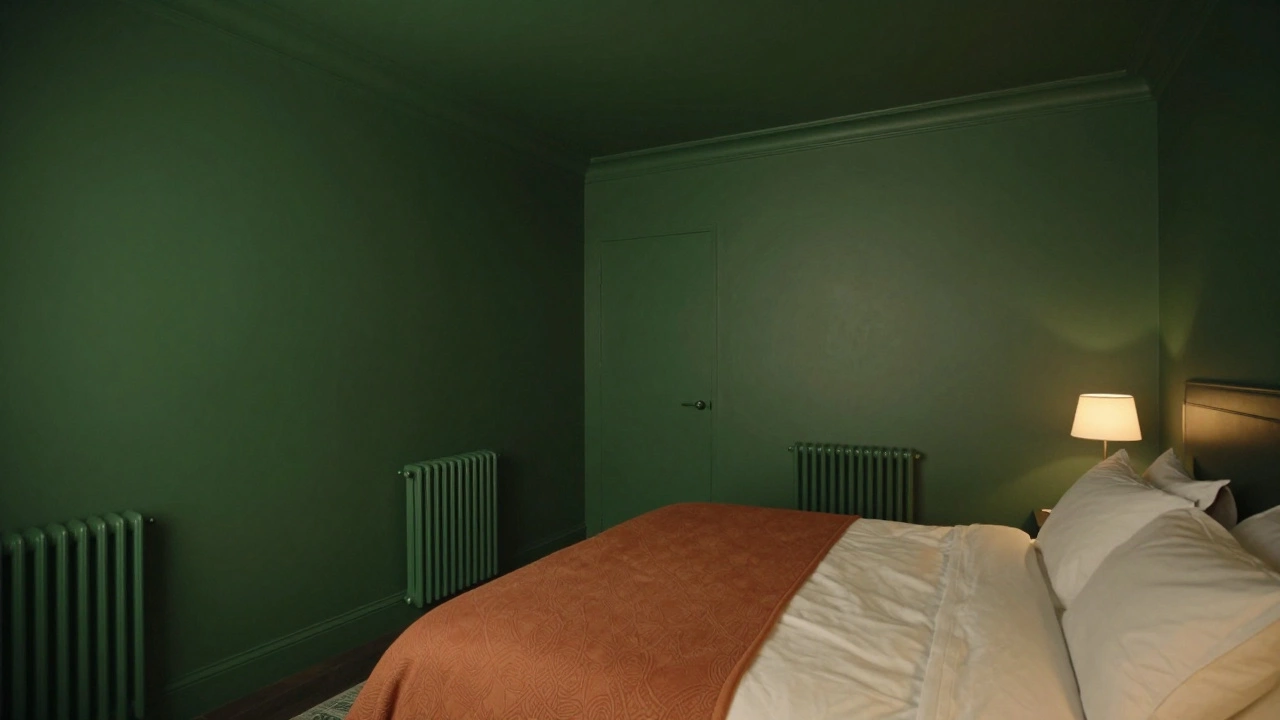
If you're tired of the accent wall but hate the idea of a boring white box, you need to know about Color Drenching. This is the practice of painting the walls, ceiling, baseboards, and radiators all in the exact same color. It's the polar opposite of an accent wall.
Why does this work? It removes the jarring lines that a single accent wall creates. Instead of the eye jumping to one spot, the room feels like a cozy, immersive cocoon. If you use a moody shade like forest green or a deep terracotta, the room feels expensive and curated. It’s a trick often used in high-end boutique hotels to make small spaces feel intentional and larger than they actually are.
How to Actually Do an Accent Wall Today
If you still really want that one specific wall to stand out, you have to do it with a strategy. Don't just pick a wall because it's the biggest one in the room. Pick the wall that actually needs a purpose.
- The Bed Headboard Wall: This is the most natural spot for an accent. Since the bed is the focal point of the bedroom, a textured wall behind it (like grasscloth wallpaper or a deep jewel tone) anchors the furniture.
- The Home Office Nook: If your desk is in a corner of a larger room, paint that specific corner and the ceiling above it. This creates a 'room within a room' and helps your brain switch into work mode.
- The Dining Alcove: Use a darker shade or a bold wallpaper in the dining area to separate it from the living room in an open-plan layout.
A pro tip: avoid 'high-contrast' pairings. Instead of pairing white with black, try pairing a light grey with a deep charcoal. These tonal shifts feel more natural and less like a 1990s hotel lobby.
Common Pitfalls to Avoid
One of the biggest mistakes people make is choosing a color that only looks good on a small swatch. When you apply a bold color to a massive wall, the intensity triples. A 'muted' teal can suddenly look like a neon sign once it covers 120 square feet of drywall. Always paint a large sample board and move it around the room at different times of the day to see how the light hits it.
Another trap is ignoring the furniture. An accent wall shouldn't be the only thing in the room with personality. If you have a bold navy wall but the rest of your furniture is basic grey and white, the wall looks like an intruder. Bring elements of that accent color into your throw pillows, art, or rugs to tie the whole space together.
What's Next for Interior Walls?
Looking ahead, we're seeing a return to Wainscoting-those decorative wooden panels on the lower half of the wall. It's a classic for a reason. It adds a level of formality and protection to the wall while allowing you to play with two different colors (darker on the bottom, lighter on the top) without the jarring effect of a single accent wall.
We're also seeing more integrated lighting. Instead of just a lamp, people are installing LED strips behind wooden panels or inside recessed niches. This means the 'accent' isn't just the color or material, but the way the light interacts with it. It turns a wall into a piece of art.
Is a single painted wall really considered 'out'?
It's not strictly 'forbidden,' but it is no longer the gold standard of design. The 'one bold wall' look often feels dated because it lacks texture and architectural purpose. Modern design favors tonal palettes, color drenching, or using materials like wood and stone to create focus rather than just a different paint color.
What is the best alternative to a painted accent wall?
Texture is the best alternative. Consider adding vertical wood slats, a lime wash finish, or high-quality wallpaper. These options add visual weight and depth to a room without the flat, sometimes jarring look of a high-contrast paint color.
How do I choose a color for a modern accent wall?
Avoid extreme contrast. Instead of white and a bright color, try a 'tonal' approach. Pair a light beige with a warm terracotta, or a soft grey with a deep slate. This creates a sophisticated transition that feels intentional and calm.
What is color drenching and does it work in small rooms?
Color drenching is painting the walls, ceiling, and trim the same color. It actually works beautifully in small rooms because it eliminates the visual 'breaks' that make a room feel choppy, effectively blurring the boundaries and making the space feel like one cohesive, larger unit.
Can I use wallpaper as an accent wall in 2024?
Yes, but the style has changed. Move away from small, repetitive patterns and toward large-scale murals, organic textures (like grasscloth), or moody, maximalist prints. The key is to treat the wallpaper as a piece of art rather than just a wall covering.