You don’t need a designer salary to get a designer-looking living room. The trick isn’t buying everything “luxury.” It’s scale, light, texture, and restraint. Use a few targeted upgrades, style them with intention, and hide anything that screams cheap (visible cords and short curtains, I’m looking at you). I live in Vancouver where light disappears half the year, so I lean on warm bulbs, bigger rugs, and clean styling-moves that read polished in any city and on any budget.
- TL;DR
- Edit ruthlessly, then go bigger: fewer, larger pieces beat many small ones. Big rug, big art, full-length lined curtains.
- Stick to a tight palette (60/30/10). Warm whites on walls, contrast in woods/metals, one pop color.
- Layer lighting: 2700-3000K, CRI 90+, dimmers, and at least three light sources in the room.
- Upgrade touchpoints: pillow inserts, curtain hardware, switch plates, lamp shades. Hide cords.
- Style with texture and negative space. Fresh branches in a heavy vase beat 15 knickknacks.
Weekend Wins That Instantly Read “Expensive”
Start with what shows first: scale, light, and surfaces. These are the fastest moves that give you the most “wow per dollar.”
-
Edit like a stylist. Pull every small decor item onto a table. Keep only what’s beautiful or personal. Group in odd numbers and vary height. Put the rest in a bin for rotation. Luxury rooms look curated because they are. If it doesn’t earn its spot, it goes.
-
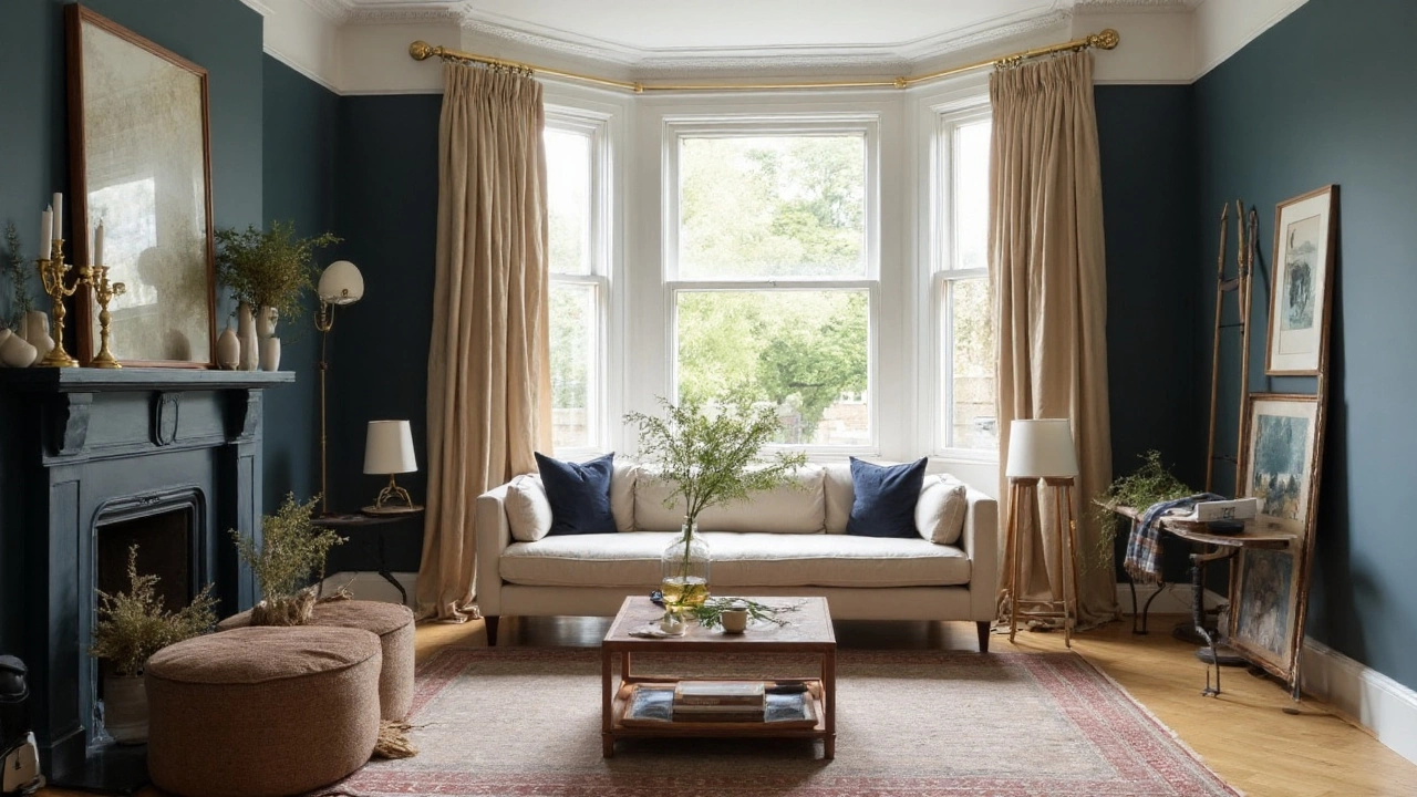
Fix the rug. The #1 giveaway of a budget room is a tiny rug. In most living rooms, you need at least an 8x10. All front sofa/chair legs on the rug. Leave 12-18 inches of floor showing around the rug if space allows. If you’re in a small condo (hello, Vancouver), choose a 6x9 and float furniture a touch.
- Quick rule: rug length ≈ sofa length + side tables; rug width lets front legs land comfortably.
-
Hang curtains high and wide. Mount rods 4-6 inches above the window frame (or just below the ceiling) and extend them 8-12 inches past each side. Curtains should “kiss” the floor or break slightly-never hover. Choose lined panels with 2x-2.5x fullness for that hotel feel. If you rent, use no-drill brackets or tension tracks. Hem tape fixes length in 10 minutes.
-
Swap bulbs and add dimmers. Use warm LEDs (2700-3000K) with CRI 90+ so colors look rich, not dull. Add a dimmer to overheads (LED-compatible). Aim for layered light: ambient (ceiling), task (table/floor lamps), and accent (picture light or sconce). The IES Lighting Handbook backs a layered approach, and it shows-your room will feel deeper and calmer.
- Light levels: 10-20 lumens per sq ft ambient, 30-50 task. In cloudy months, bump task lamps.
-
Style surfaces with intention. On the coffee table, create three “zones”: a stack of books + a sculptural object, a heavy vase with branches, and a candle or box. Keep 30-40% clear. On consoles, use a “tall-medium-low” triangle and repeat a color from your rug or art.
-
Upgrade pillow inserts and shades. Use feather/down or down-alternative inserts 2 inches larger than the cover (e.g., 22" insert for 20" cover). Swap plastic-y lamp shades for linen or paper drum shades. The light diffuses softer, instantly pricier.
-
Hide the tech. Run cords under rugs (flat cord covers help), zip-tie behind the TV, and use a cable box. A picture-frame TV look or art leaned in front of a TV when off reduces the black void. Nothing cheapens a room faster than cable spaghetti.
-
Hang art right. Center at 57 inches from floor to artwork center-common gallery standard used by many museums. If it’s above a sofa, the piece or grouping should be about 2/3 the sofa width and hang 6-8 inches above the back.
-
Add nature. One large, architectural branch (eucalyptus, maple, or magnolia) in a weighted vase looks luxe and costs little. Real beats faux up close; if you go faux, pick matte stems and cut them to a believable length.
Do those eight and your place already reads like you spent a lot more. If you have another weekend, move to the plan below.
The Step-by-Step Plan: Palette, Layout, Lighting, Materials
Here’s the simple framework I use with clients and in my own place.
-
Choose a tight color palette (60/30/10)
- 60% base: walls, big rug, large sofa. Go warm and calm (e.g., warm white walls with an LRV around 70 for brightness that isn’t stark).
- 30% support: wood tones, accent chairs, drapes. Keep undertones consistent (all warm or all cool).
- 10% pop: pillows, art, a bold side chair, or a lacquered tray. Repeat the pop color at least twice.
Test paint on two big boards and move them around the room morning to night. In Vancouver’s gray light, warm whites (think creamy without yellow) stay cozy. Paint sheen: matte/eggshell for walls, satin for trim. Benjamin Moore and similar brands note satin/semigloss trim resists scuffs better.
-
Get the layout right
- Conversation feels expensive. Keep 14-18 inches between sofa and coffee table, and 30-36 inches for main walkways.
- Float the rug off walls; avoid lining everything around the perimeter.
- Balance weight: if a heavy sofa sits left, add a tall plant or floor lamp right.
-
Invest where you touch and see
- Spend more on: sofa (comfort + silhouette), rug (size + texture), lined drapery, one great light fixture.
- Save on: side tables, trays, simple bookcases (style them well), secondary pillows.
- Mix high/low: one statement piece makes everything around it feel pricier.
-
Design a lighting “stack”
- Ambient: ceiling fixture with dimmer. If you have cans, use warm, narrow-to-wide beam spread for even coverage.
- Task: table lamps at sofa ends; a floor lamp near a reading chair.
- Accent: picture light, wall sconce, or small uplight behind a plant for drama.
- Specs that matter: 2700-3000K, CRI 90+. The IES backs color rendering for accurate finishes. Your wood and textiles will look richer.
-
Work the materials
- Texture stacking: linen, bouclé, velvet, nubby wool, leather, raw wood, stone, metal. Aim for at least five textures in the room.
- Metal mix: two finishes max (e.g., antique brass + black). Repeat each at least twice so it looks intentional.
- Gloss is risky: use matte/satin on big surfaces; keep gloss for small accents.
-
Windows: treat them like a suit
- Lined curtains or Roman shades look custom. Even IKEA panels feel upscale if you add pleat hooks and weight the hem.
- Fullness rule: panel width adds up to 2x-2.5x the window width.
- Blackout liner for bedrooms; in living rooms, privacy + light-filtering feels luxe.
-
Art and mirrors
- Big beats many small. One oversized canvas or a tight gallery grid with wide mats looks expensive.
- Use a mirror to bounce light across from a window, not directly opposite (you’ll reflect glare).
- Mat width: 2-3 inches minimum around the artwork. It makes even a print look like a piece.
-
Storage that hides
- Closed-front credenzas beat open cubes. Basket + lid beats basket only.
- Ottomans with hidden storage swallow blankets and remotes.
- Anchor tall bookcases to studs for safety; the U.S. CPSC warns about tip-over injuries. Safety can still look chic.
-
Mind scent and sound
- One subtle diffuser or candle is plenty. Hotel scent levels are low and consistent.
- Textiles and rugs kill echo; soft rooms read rich.
This plan is flexible. If you’re tight on budget, finish a category each month-paint in October, rug in November, drapes in December. By winter, your living room will feel new.
Style Like a Pro: Textiles, Layers, and High-End Details
Upscale rooms are less about price and more about taste and edit. Here’s how to hit that mix without guessing.
-
Pillow game
- Insert 2 inches larger than cover. Mix scales: one bold pattern, one small pattern, one textured solid.
- Colors: repeat from your rug or art so it looks tied together.
- Odd numbers on sofas; even pairs on chairs.
-
Coffee table styling
- Three zones: books + object, floral/branch, candle/box.
- Vary heights (tall-medium-low) and shapes (round + rectangular + organic).
- Tray earns its spot if it corrals remotes and coasters; if not, skip it.
-
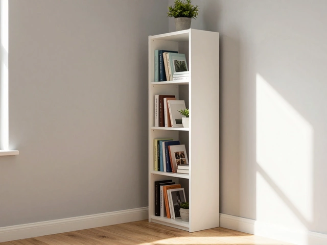
Bookshelves, not clutter shelves
- Think 60% books, 30% objects, 10% air.
- Break rows with horizontal stacks. Add a framed photo sparingly.
- Repeat colors across shelves for rhythm, but avoid rainbow-order unless it suits your vibe.
-
Hardware and small swaps that look pricey
- Switch plates: go screwless covers. It’s a small cost, big polish.
- Cabinet pulls: weighty metal beats hollow. Keep finishes consistent with your lighting.
- Lamp shades: switch to linen or parchment. Black shades give moody evening light, white shades brighten.
- Door stops, vent covers, and curtain rings: tiny details add up.
-
One signature piece
- Oversized art, a sculptural chair, or a brutalist stone side table. You only need one.
- Build quiet around it; negative space is free and feels high-end.
-
Greenery that earns its keep
- Large-scale plant (olive tree, rubber plant) in a simple pot. Top with soil cover (fine gravel or moss) for a finished look.
- Faux? Choose matte leaves and wipe dust monthly.
-
Textile layering for depth
- Rug on rug: flatweave base + plush layer under the coffee table.
- Throws: one draped, one folded. Stick to natural fibers where you can-cotton, wool, mohair, linen.
-
Avoid these “budget tells”
- Tiny rugs, short curtains, glossy furniture finishes, cool blue bulbs (5000K makes skin and wood look flat), overly matchy furniture sets, too many small knickknacks, visible wires.
One more styling trick: if the room feels busy, remove three things. If it still feels busy, remove three more. Luxury rooms breathe.
Checklists, Formulas, FAQs, and Next Steps
Bookmark this section. It’s your quick reference when you’re shopping or hanging stuff.
Size + Placement Cheat Sheet
- Sofa-to-coffee table: 14-18 inches.
- Coffee table length: ~2/3 of sofa length; height within 2 inches of sofa seat height (16-18 inches for most).
- Rug: front legs of all seating on; 8x10 minimum for most standard rooms.
- Art height: 57-inch center from the floor; 6-8 inches above furniture.
- TV height: eye level when seated; distance ≈ 1.5x screen diagonal works well with 4K.
- Curtain rod: 4-6 inches above frame, extend 8-12 inches wider each side; panels “kiss” the floor.
- Lighting: at least three sources; 2700-3000K, CRI 90+, dimmable.
Budget Priorities (pick a tier)
- $200-$400: bulbs + dimmer, curtain hemming, pillow inserts, one big branch vase, screwless switch plates, cable management.
- $600-$900: add an 8x10 rug, two linen curtain panels with proper fullness, one statement lamp.
- $1,200-$2,000: quality rug + lined drapery + one hero light fixture or art piece. Keep existing sofa, re-style everything else.
Mini-FAQ
- How do I make a small living room look expensive? Use a larger rug than you think, a glass or slim coffee table, and floor-to-ceiling curtains. Keep a tight palette and let one standout piece lead.
- What paint color reads most luxe? A warm white or soft greige with a high LRV (60-75) keeps the room bright and calm. Test in your light; northern light (common here) pushes cooler.
- Do I need real wood? Not everywhere. Put real materials where you touch: wood coffee table, stone tray, linen shades. You can fake the rest if you style it clean.
- Are gallery walls still in? Yes-if they’re tight and cohesive. Same frames, wide mats, consistent spacing. Or go one oversized piece for immediate impact.
- Best curtain fabric on a budget? Linen-blend or cotton twill, lined. Add pleat hooks or clips for a tailored drop.
- How many pillows on a sofa? 3-5 for a standard sofa, 5-7 for a sectional. Odd numbers feel casual-luxe.
- What about smart bulbs? Great for scenes and dimming. Choose warm white ranges and high CRI. Avoid harsh cool whites in living spaces.
- Do I need to match metals? No. Mix two finishes, repeat each at least twice. Black + aged brass is a safe combo.
Troubleshooting by Scenario
- Low ceilings: hang curtains just under the ceiling, use vertical stripe or tall bookcases, and choose low-profile sofas to stretch the wall visually.
- Low natural light: double down on lamps and warm bulbs, add a mirror off-axis from the window, and pick warm whites on walls. Glossy white won’t fix dark; it can feel cold.
- Kids and pets: choose performance fabrics (crypton-like or tightly woven), patterned rugs (hide stains), rounded-edge tables, and anchor shelves to walls. Use washable slipcovers.
- Rental rules: use peel-and-stick wallpaper, tension rods for drapes, art rails, and freestanding shelves as “walls” to create zones.
- Open concept: create islands of light. Each zone gets its own rug and lamp set. Repeat color/materials across zones for cohesion.
- Tight budget: do the “touchpoints” first-bulbs, dimmer, curtain hem, pillow inserts, cable hide. Then one big win (rug or drapes). Then styling.
Pro Tips (from the field)
- When in doubt, go bigger. Large art, large rug, large plant. It reads custom.
- Repeat each color and finish at least twice. That’s how the room looks intentional.
- Leave negative space. Empty corners and blank wall sections are not failures; they’re breathing room.
- Take photos of your room. You’ll spot clutter and odd spacing instantly on screen.
- Do a night check. Dim the lights and see where shadows fall. Add a small uplight behind a plant for depth.
One last nudge: Luxury is often the absence of mistakes, not the presence of expensive stuff. Fix the easy tells, scale up the anchors, and style with confidence. That’s how you make living room look expensive without draining your savings.