Bedroom Curtain Colors: How to Pick the Right Hue
When planning Bedroom curtain colors, the shades you hang over your windows that affect mood, privacy and perceived room size. Also known as curtain color options, they play a key role in bedroom aesthetics. Complementary to room perception of space, how a color can make a small bedroom feel larger or a large room feel cozier, these hues interact with interior design trends, current style directions that influence color popularity and the fabric material, cotton, linen or blackout fabrics that affect light filtration you choose. The right combination also depends on light exposure, natural sunlight or artificial lighting that alters how a hue appears at different times of day. Understanding these connections lets you pick a shade that not only looks good but also improves comfort and function.
Why the Right Shade Matters in a Bedroom
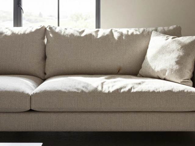
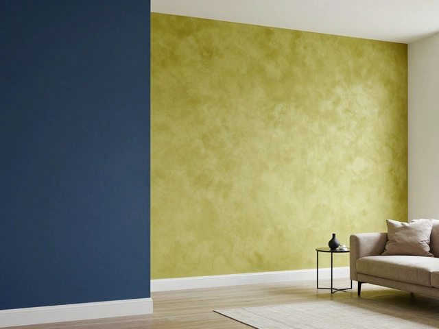
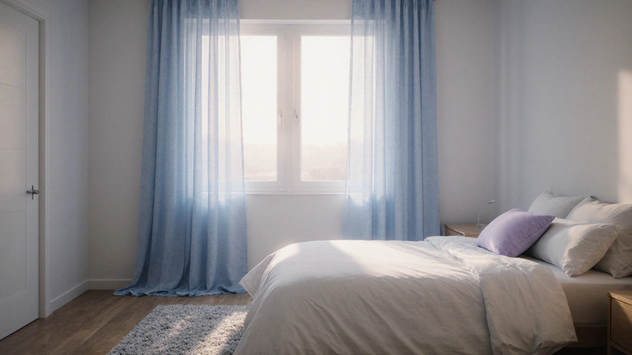
Think about walking into a room where the curtains swallow the light, making the space feel cramped. Now picture a soft, neutral tone that bounces daylight around the walls, instantly adding depth. That contrast is the power of curtain colors. Light-colored curtains—think ivory, pale gray, or muted pastels—reflect natural light, which tricks the eye into seeing a larger area. Conversely, dark hues such as navy, charcoal, or deep green absorb light, creating a snug, intimate vibe ideal for master suites that aim for a cozy retreat. Color psychology also plays a role: blues calm the mind, greens promote relaxation, while warm reds can energize a space. Matching the color to the room’s purpose helps you sleep better, unwind, or get ready for the day. When you combine color with fabric choice, the effect multiplies. Heavy, blackout fabrics in a dark shade will block out light, perfect for night‑shift workers who need a true dark environment. Light, sheer linen in a pastel hue lets sunshine filter through, keeping the room bright and airy. The texture of the fabric changes how the color shows up—smooth satin can make a hue look richer, while a rough burlap gives a more muted, earthy feel. Lighting conditions are another variable. A room that faces north receives cooler, softer light, which can mute warm colors and make them appear gray. In such spaces, lean toward warm undertones or brighter shades to counteract the coolness. South‑facing rooms get strong, warm sunlight; here, you can safely use cooler colors without them looking washed out. Artificial lighting—LEDs with high CRI values—also reveals true color fidelity, so testing swatches under your ceiling lights before committing is a smart move. Current interior design trends reinforce the idea of flexibility. 2024’s palette blends soft neutrals with bold accent shades. Designers often pair a muted main curtain color with a contrasting trim or tie‑back in a striking hue to add visual interest without overwhelming the room. This approach lets you update the look seasonally—swap the accessories rather than the entire set. Finally, maintenance matters. Dark fabrics show dust and wear faster, requiring more frequent cleaning. Light fabrics hide stains but may fade under harsh sun. Picking a color that aligns with your lifestyle—whether you have kids, pets, or lots of natural light—helps keep the bedroom looking fresh for years. All these factors—size perception, design trends, fabric type, lighting, and upkeep—interlock to create the perfect bedroom atmosphere. Below you’ll find a hand‑picked collection of articles that dive deeper into each aspect, give you step‑by‑step guides, and share expert tips so you can make an informed decision and transform your bedroom with confidence.
Best Bedroom Curtain Colors: How to Choose the Perfect Hue
Discover how to pick the perfect bedroom curtain colors using color psychology, lighting, fabric and design style tips for a cozy, stylish retreat.
full article