Color Temperature – How Light Shapes Your Home
When working with color temperature, the measurable hue of light expressed in Kelvin, which tells you how warm or cool a light source appears. Also known as light temperature, it helps set mood, highlight colors, and guide design choices. Understanding this concept is the first step toward smarter lighting, smoother interiors, and even better curtain selections.
Lighting covers the fixtures, bulbs, and placement that deliver light into a space is directly tied to color temperature. Warm lighting (around 2700‑3000K) creates cozy evenings, while cool lighting (4000‑5000K) boosts focus in kitchens or offices. Choosing the right temperature means matching the room’s purpose with the visual feel you want.
LED bulbs are energy‑efficient light sources that come in a full range of color temperatures have become the go‑to option for most remodels. Because LEDs let you dial in exact Kelvin values, you can swap a warm lamp for a cool one without rewiring. This flexibility makes it easy to experiment and fine‑tune the ambience in any room.
Design Connections
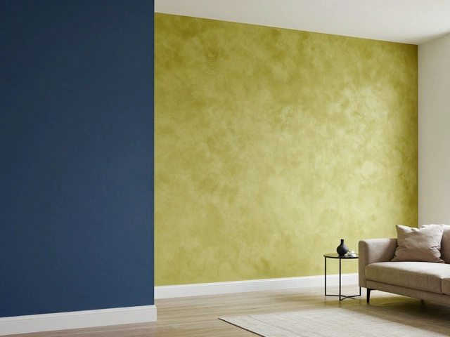
In interior design the art of arranging spaces, colors, and furnishings to create a cohesive look, color temperature serves as an invisible brushstroke. A cool kitchen paired with bright countertops feels clean, while a warm living room paired with plush sofas feels inviting. Designers often adjust temperature to balance natural daylight, which can shift from cool in the morning to warm at sunset.
Even something as simple as curtain color the hue and fabric of window treatments that filter light into a room plays a role. Light, pastel curtains let cooler light pass through, enhancing a crisp atmosphere. Dark, warm‑toned drapes absorb light, deepening a room’s warmth. Selecting the right curtain shade can reinforce the intended temperature without changing the bulbs.
These relationships form a clear chain: color temperature influences lighting choices, which require suitable LED bulbs, and both affect interior design decisions, including curtain color. By treating temperature as a design parameter, you gain control over mood, functionality, and visual harmony.
Practical steps start with measuring the existing light. Grab a smartphone app that reads Kelvin or just note the bulb’s label. Next, decide the room’s primary activity: cooking, relaxing, working, or entertaining. Choose a temperature that supports that activity—cooler for work, warmer for relaxation. Then, swap out mismatched LEDs and test different curtain fabrics to see the impact in real time.
For open‑plan homes, layering is key. Use a mix of warm ambient fixtures and cool task lights to create zones. Spotlights over art can be cooler to highlight colors, while floor lamps in the lounge stay warm for comfort. Remember, the goal isn’t a single temperature throughout but a balanced palette that guides the eye.
When you finish adjusting temperature, you’ll notice how paint colors respond as well. Light blues and greys feel more spacious under cool light, while reds and golds glow under warm light. This synergy explains why many designers pair paint palettes with specific temperatures—each element reinforces the other.
Below you’ll find a curated list of articles that dive deeper into each of these aspects. From DIY lighting swaps to curtain‑color pairings and LED buying guides, the posts give you step‑by‑step advice so you can apply the right color temperature strategy in any room of your house.
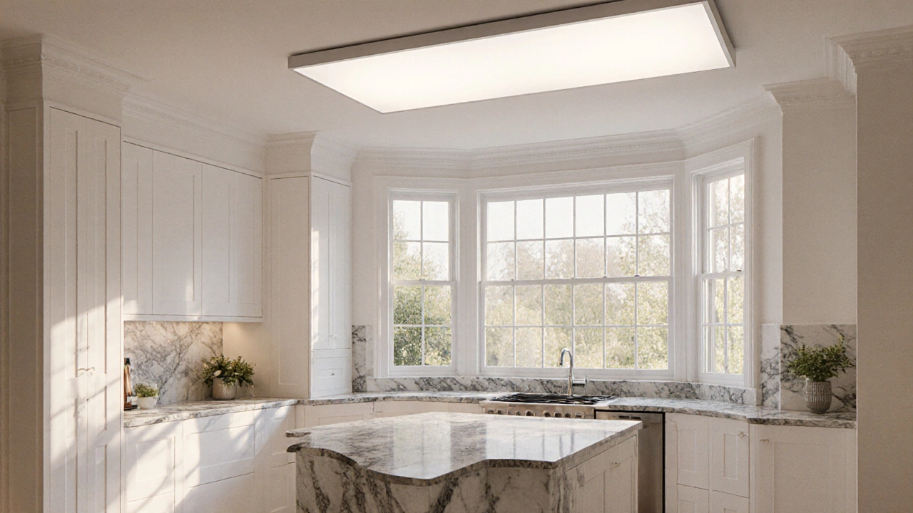
Best Lights That Mimic Natural Sunlight - 2025 Guide
Discover the lighting types that most closely replicate natural sunlight, learn key specs like CRI and Kelvin, and get practical tips for choosing and installing daylight‑mimicking bulbs.
full article