Ever hang a picture, step back, and think, “Why does this look… off?” You’re not alone. Most people ignore the wall art rule, or they don’t even know there is one. The shortest answer? Hang art so the center sits at eye level—about 57 to 60 inches from the floor. That’s the magic spot galleries use, and it works at home too.
This small trick makes art feel grounded and balanced. When everything is too high, it floats above the furniture and looks disconnected. Too low, and it feels cramped. Keep the sweet spot in mind, and suddenly rooms look finished, not awkward. If you’re taller or shorter than average (or your family, like Finn and Nora, think kids’ height is the gold standard), start with 57 inches and tweak a little for comfort. There’s no need to measure to the millimeter—but the eye-level rule is a lifesaver for most spaces.
- The Centerpiece Rule: Eye-Level Explained
- Size and Scale: Choosing Art that Fits
- Spacing and Grouping: Avoiding the Clutter Trap
- Common Mistakes and Quick Fixes
The Centerpiece Rule: Eye-Level Explained
If there’s only one wall art trick to remember, it’s this: hang your artwork so the center sits at eye level, between 57 and 60 inches from the floor. Most museums and galleries swear by 57 inches because that’s pretty much average adult eye line, and there’s real science behind it. This height feels natural and keeps your artwork from looking like it’s floating off into space or sinking down to the floorboards.
Renowned interior designer Nate Berkus summed it up:
“When people hang art too high, it breaks up the connection between the piece and the furniture below. Bringing art down to eye level instantly brings the room together.”
The math is easy, too. Measure up 57 inches from the floor, mark the wall, and use that mark as the vertical center of your artwork (not where the hook goes, but the midpoint of the frame). If the art is huge or the room has high ceilings, you can inch up a little, but don’t let the art escape the neighborhood of your furniture. Eye-level still wins for just about every room—living rooms, bedrooms, hallways, you name it.
- If you’re hanging a series (like a gallery wall), pretend the whole group is one giant piece. Find the midpoint of the entire arrangement and start at 57 inches.
- Above a couch or console, try to keep the bottom edge of the art 6 to 12 inches above the furniture. That leaves enough breathing room but keeps everything connected.
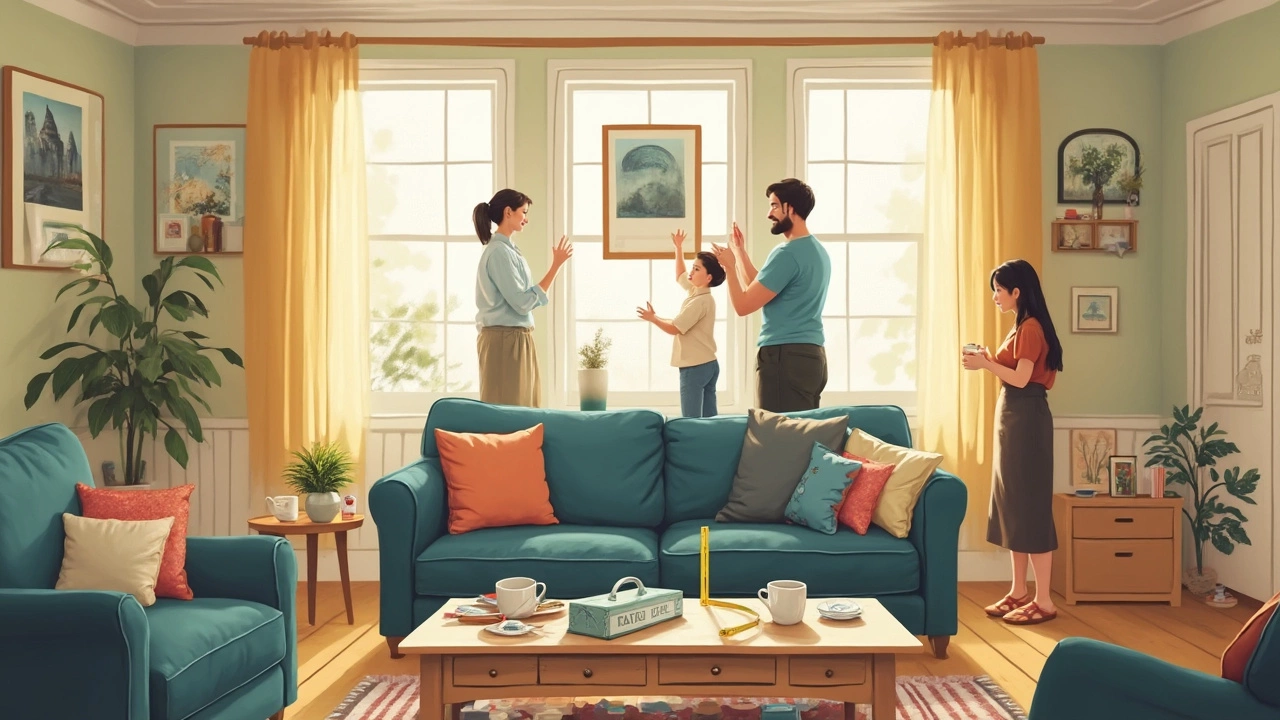
- Kids’ rooms and play zones can break the rule—drop art closer to their eye level for a playful touch. My son Finn loves when he can see his dinosaur prints right at his height.
Here’s how the eye-level rule compares to other common hanging heights people use at home:
| Hanging Height (from floor to artwork center) | How It Looks in Most Rooms |
|---|---|
| 57 inches | Balanced, gallery feel |
| 65 inches | Too high, disconnected from furniture |
| 45 inches | Too low, cramped vibe |
Stick with the eye-level approach and you’ll nail that pro look every time, even if you’re just hanging your kids’ latest masterpieces. If someone comments, "Wow, did you get a designer in here?"—well, now you know the secret.
Size and Scale: Choosing Art that Fits
This is where folks mess up most often—choosing wall art that's the wrong size for the space. If the art is too small, it gets lost. If it’s too big, it takes over. The rule of thumb: your art should cover about two-thirds to three-quarters of the furniture it's hanging above. That means a 60-inch sofa calls for art (or a grouping) that’s about 40 to 45 inches wide. This creates balance so your wall art feels like part of the room, not an afterthought or a weird focal point.
Here’s a simple formula that helps:
- Measure the width of your furniture (like a sofa or a bed).
- Multiply that number by 0.66 to 0.75.
- That’s how wide your art, or the whole group of pieces, should be.
A respected interior designer, Emily Henderson, puts it bluntly:
"Art that’s too tiny above a sofa is the biggest wall decor mistake. Go bigger than you think—or at least go wider with a set."So if you love a small piece, use it as part of a gallery wall with a few friends, not stranded on its own.
What about height? Try to keep your art from trailing way above the furniture. Shoot for four to six inches between the top of the sofa and the bottom of the frame. Hang it too high, and it loses its connection to the rest of the room. Too low, and you risk accidental head bumps—especially if you have little ones like Finn and Nora running around.
Just to show how much better a well-sized piece looks, check this quick table:
| Furniture Width | Ideal Art Width |
|---|---|
| 50 inches | 33–38 inches |
| 60 inches | 40–45 inches |
| 72 inches | 48–54 inches |
Big wall? Don’t force yourself to fill it with a single giant piece if that’s not your vibe. A grid or gallery arrangement works just as well if the overall footprint follows the same scale rules.
It’s tempting to go with whatever’s on sale at the store, but a little planning pays off. Get the wall art sizing right, and your room starts looking magazine-ready—even if your dog just tracked mud in again.
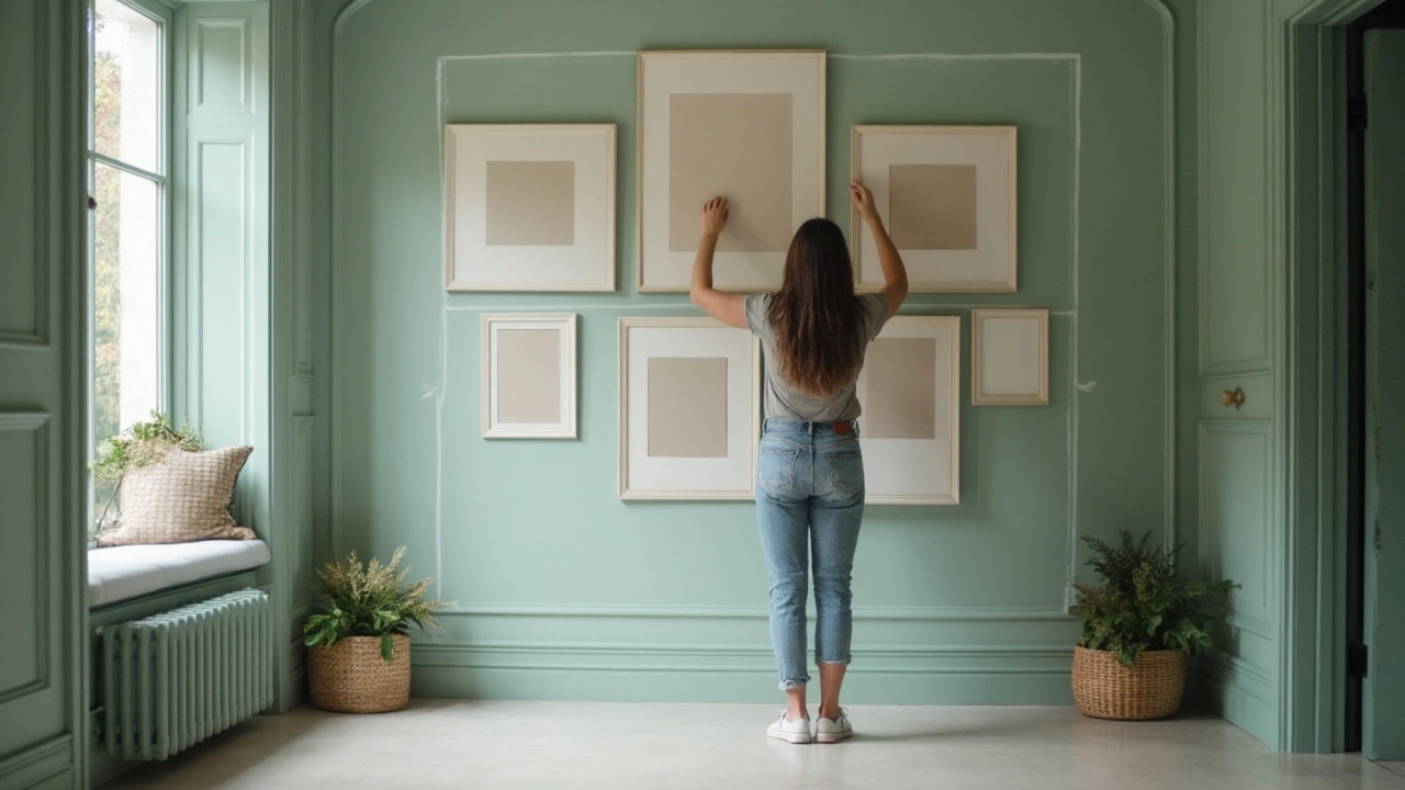
Spacing and Grouping: Avoiding the Clutter Trap
If you’ve ever stared at a blank wall and wondered how many pieces you can hang before it looks like chaos, you’re asking the right question. The trick is spacing—too close and everything blurs together, too far and it feels disconnected. As a rule of thumb, leave about 2 to 6 inches between frames in a group. This gives each piece its own room without breaking the bond of the group.
For a single large piece, keep about 6 to 8 inches of space above furniture. If you're making a gallery wall, start in the center and work out. Lay everything out on the floor first so you can move pieces around easily before putting holes in the wall. Snap a photo to see how it looks—your phone is a better judge than your memory.
When grouping art, use frames and sizes that have some connection: color, style, or subject. If you have a wild mix (Finn once tried to stick his superhero posters next to my vintage travel prints), anchor your wall with a dominant piece in the center, then build around it with pieces that echo its color or vibe. You don’t need everything perfectly matched. It’s about flow, not clones.
Here's a breakdown that helps people visualize the right balance for a wall art display:
| Number of Pieces | Recommended Spacing (inches) | Best Visual Tip |
|---|---|---|
| 2-3 | 3-6 | Keep to same height; align edges |
| 4-6 | 2-4 | Center main piece, group close |
| Gallery (7+) | 2-3 | Mix horizontal & vertical, keep rhythm |
If your grouping starts to look messy, take one or two pieces out. Breathing room is what separates a gallery wall from Grandma’s wallpapered memory lane. White space gives your art a chance to stand out, and actually makes your room feel lighter. Don’t be afraid to nix a frame if it feels off. Your wall—your story, but no one likes clutter.
Common Mistakes and Quick Fixes
Most people mess up hanging wall art in the same few ways. Let’s bust through them and get your space looking sharp—no pro needed.
- Hanging too high: This is probably the #1 oops. Folks want to "show off" art, but if you put it way above eye level, it loses its impact. Remember, aim for the center of your art to hit around 57 to 60 inches off the ground. Fix it by dropping your frames lower, especially over sofas or beds—leave about 6 to 8 inches between the bottom of the art and the top of the furniture.
- Going too small: Tiny photos stuck on a big blank wall make the whole room feel weird. If you’re working with a large wall, go for a big piece or group a few pieces so they take up two-thirds to three-fourths of the furniture width below. Single 8x10s are for desks, not over a couch.
- Bad spacing in gallery walls: Photos and frames that are crammed together or, worse, floating too far apart kill the vibe. Keep gaps between pieces tight—about 2 to 3 inches. This keeps things looking planned rather than random.
- No anchor point: Art shouldn't float in space. If you’re not sure where to start, anchor your art above a sofa, console, or bed. It gives the arrangement purpose and draws the eye right where you want it.
- Using weak hardware: If frames are always askew, cheap hooks could be the culprit. Use quality hanging kits and, for heavier items, use wall anchors. That way you don’t wake up to a crash at 2 AM.
Here’s a quick visual to get things right. The numbers come from a study by an interior design group in Chicago that reviewed 200+ decorated homes:
| Mistake | % of Homes Affected | Quick Fix |
|---|---|---|
| Art hung too high | 68% | Lower to eye-level (57-60 inches) |
| Art too small for wall | 49% | Use bigger frames or group art |
| Poor spacing/gaps | 36% | Space 2-3” between pieces |
Nailing the wall art rule isn’t rocket science, but getting these simple details right makes your whole room feel intentional. Next time you hang a picture, check for these goofs and tweak as needed. Your walls will thank you.