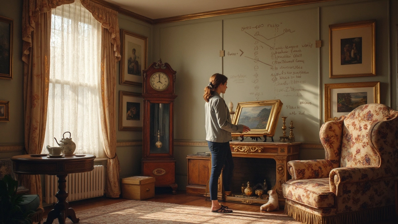
Ever stared at a blank wall and wondered how to make it pop without overdoing it? Enter the 60 40 rule, a handy guideline in interior design that might just be your new best friend. This rule is all about achieving the perfect balance between different elements in a room. Think of it as a ratio where 60% of your wall is dedicated to the main elements, like art and frames, and the remaining 40% is left open to avoid a cluttered look.
So, why does this matter? Well, it helps create an appealing visual balance that's easy on the eyes. Overloading a wall with art can make a room feel crowded, while too little can leave it looking bare and uninviting. With the 60 40 rule, you can find that sweet spot where your art enhances without overwhelming.
Picture this: you've found a fantastic painting or photo and want to showcase it in your living room. By using the 60 40 rule, you're guided on exactly how much space it should take up and how to complement it with other pieces or leave some breathing room. It's about creating harmony and rhythm, making your space both lively and restful at the same time.
- What is the 60 40 Rule?
- The Science of Balance in Design
- Applying the Rule to Wall Art
- Common Pitfalls and How to Avoid Them
- Creative Tips for Art Placement
What is the 60 40 Rule?
Let's get straight to it. The 60 40 rule is a guideline that's widely used in interior design, providing a balanced and aesthetically pleasing setup for spaces, particularly when it comes to wall art. This rule is all about maintaining a balance between the occupied and unoccupied spaces. Specifically, 60% of an area is designed to be the primary focus, occupied by the main components of the design, while the remaining 40% provides breathing room or acts as supportive space.
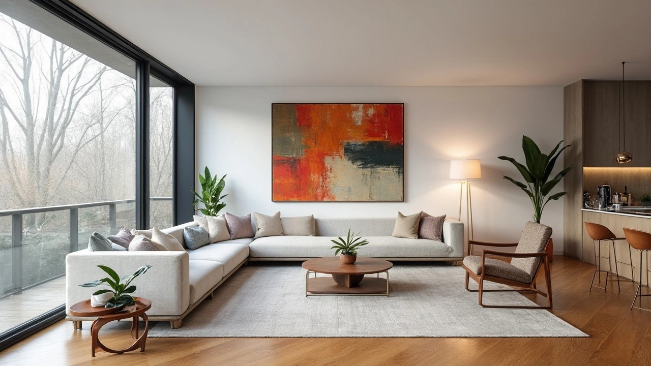
Think of a spacious living room. The wall acts as your canvas. Applying the 60 40 rule means using 60% of this space for your standout pieces, like a large painting, a series of photographs, or maybe a striking mural. The remaining 40%? That’s not about going empty, but giving your eyes a place to rest, ensuring the room doesn't feel overcrowded.
Why 60 and 40?
This ratio has been favored because it inherently maintains harmony. It prevents designs from feeling either too empty or too cluttered. When your wall is mostly occupied, but not entirely so, it creates a visual rhythm that's both engaging and relaxing. This balance is akin to the golden ratios found in nature, which people naturally find pleasing.
With wall art, this approach helps you determine both the quantity and size of pieces you should use. A helpful tip is to first pick out one big art piece or focal point; from there, decide what smaller items can complement it without overwhelming the space. It’s about making thoughtful choices so your art feels like a conversation, not a chaotic mix.
The Science of Balance in Design
So, we're diving into the science behind what makes a room feel just right. It’s not magic; it’s often a well-thought-out design trick like the 60 40 rule that designers swear by to get that cozy, well-balanced vibe.
Balance in design is all about distributing visual weight evenly across a space. Think about how you feel when you walk into a room that just 'flows'—that's balance at work. According to design expert Nate Berkus, "The right balance helps create a room that's comforting and easy to love."
The right balance helps create a room that's comforting and easy to love. - Nate Berkus
Understanding Visual Weight
Visual weight is something you might not consciously notice, but it's there. It's how heavy or light something looks based on its color, size, shape, or texture. Dark colors, large sizes, and complex shapes tend to appear heavier. When you're dealing with wall art, these elements play a crucial role in how your collection is perceived.
Using Symmetry and Asymmetry
Now, balance doesn’t mean everything has to be same-same mirrored. There’s symmetry, but there’s also asymmetrical balance, where you create a feel of equilibrium with different or non-identical elements. Imagine placing a large painting on one side of a wall and balancing it with smaller frames on the other. It's like a visual seesaw that stays perfectly level.
Practical Application
Implementing the 60 40 rule involves a bit of trial and error, but it’s also a chance to get creative. Start by choosing your dominant color or focal piece for that 60% portion. Use supporting elements or 'white space' for the 40%. Here’s a quick tip: always step back and take a look. Sometimes what seems right up close might feel off from across the room.
For those into specifics, having a visually well-rounded room can increase the perception of comfort and relaxation by up to 30%, as suggested by recent studies.
Applying the Rule to Wall Art
Let's dive into how you can actually apply the 60 40 rule to your wall art. It's all about balance, and who doesn't love a well-balanced room? So, when you're decorating a wall, remember that 60% of the wall should be devoted to art and decor, while the other 40% should be left open to give your eyes some breathing room.
How to Measure and Decide
Start by measuring the wall space. Let's say your wall is 10 feet wide; according to the 60 40 rule, 6 feet can be covered with art or other decor pieces, and 4 feet should remain open. This ensures that your interior design neither overwhelms nor underwhelms. Simple, right?
Use a measuring tape to define the 60% area you'd be working with. Sketch your ideas or use some painter's tape on the wall, so you have a visual guide of your future design.
Arrangement Techniques
When arranging your wall art, start with larger pieces first. These will be the anchor elements and can take up the most space in that 60% area. Smaller pieces can surround these bigger ones to create a cohesive look.
- Use the largest piece as the focal point.
- Arrange smaller pieces around the larger one. You can experiment with symmetry if you want a more formal look.
- Try mixing frames and artworks of various sizes for a more dynamic look.
Consistency is Key
Color schemes also matter when applying the 60 40 rule. Keep your frames or pieces within a similar color palette to avoid clashing. This trick helps in maintaining a harmonious feel in the room.
Don't Forget the Lighting
Lighting plays an underrated role in making your wall art pop. An overhead light or a strategically placed lamp can throw the spotlight on your beautiful works, emphasizing them even more.
In short, using the 60 40 rule can help make sense of what might otherwise be an overwhelming task. Get it right, and your walls will enhance the room rather than dominate it. Now, go ahead and make those walls fantastic!
Common Pitfalls and How to Avoid Them
When it comes to leveraging the 60 40 rule in interior design, most people trip up with a few sneaky pitfalls. Let's talk about these, so you can bypass them altogether.
Overloading the Wall
The first big mistake is placing too much wall art without considering spacing. Sure, it might be tempting to cover every inch with your favorite pieces, but it can leave the space feeling overwhelming. Instead, ensure you follow the rule by keeping 60% of the wall for your primary art pieces.
Underestimating Scale and Proportion
Another common error is getting the proportions wrong. Sometimes, folks pick pieces that are either too small or too large for the space. You want to go for pieces that fill about 60% of the intended area, allowing the remaining space to serve as a visual breather.
Ignoring Room Functionality
The function of the room often gets ignored. For instance, what works in a living room might not suit a kitchen. Consider the room’s purpose and choose art that complements, rather than clashes with your room’s vibe.
Poor Hanging Technique
The way you hang your art matters. Place art at eye level for the best view. A tip? When sitting, position your art about 6-8 inches above the furniture.
- Stick to a color palette that ties with other elements in the room.
- Rotate art pieces every few months to refresh the look.
- Consider framing styles that add depth while aligning with existing decor.
Remember, experimenting is part of the process. Don’t fear a little trial and error to get your decorating just right.
Creative Tips for Art Placement
Placing wall art isn't just about hanging pictures willy-nilly. It's an art form in itself, blending style, personal taste, and the space's unique needs. Here are some straightforward tips to make any artwork pop.
Start with Eye Level
First off, let's talk about height. The golden rule: place artwork at eye level, which is typically around 57 to 60 inches from the ground. This positioning draws viewers naturally to the pieces.
Think in Odd Numbers
Odd numbers might seem odd, but they work wonders in design! Arranging art pieces in groups of three or five tends to create visual interest and a more dynamic look.
Consider the Context
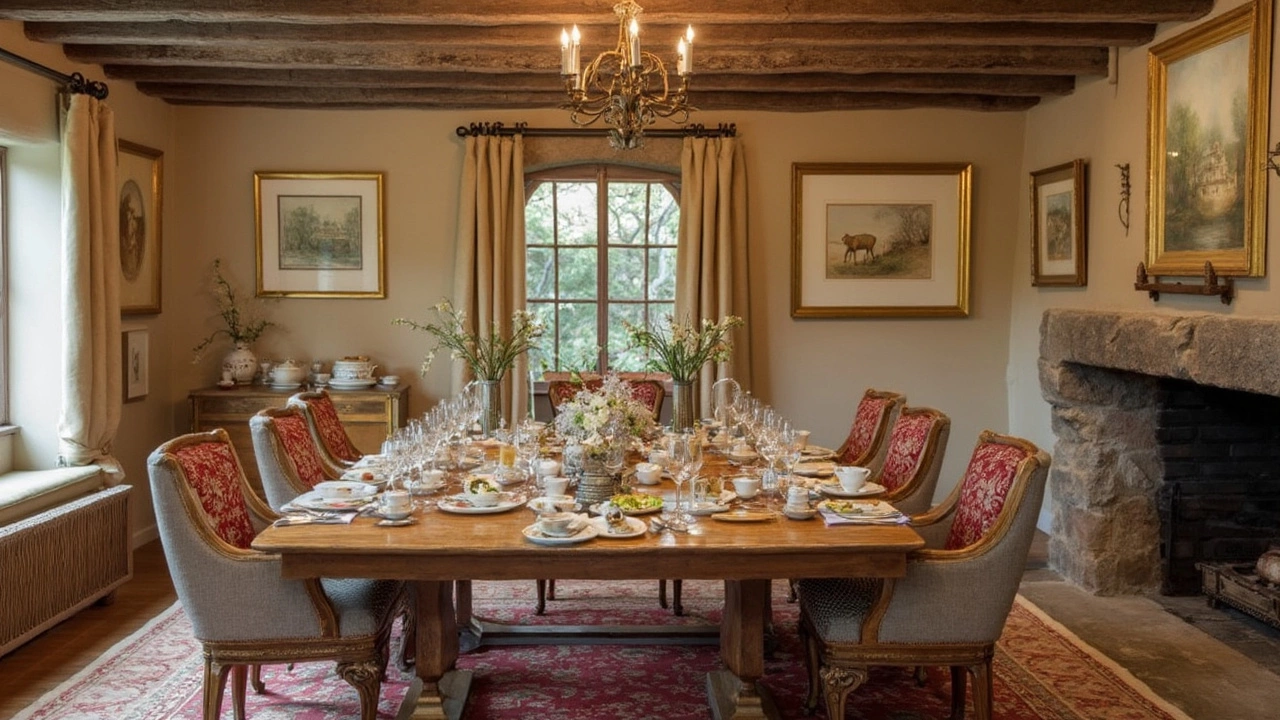
Take a good look at your surroundings. Got a massive wall in the living room? A large, bold piece might fit right in. In contrast, smaller walls benefit from collections or smaller art sets up.
Mix and Match
Don't be afraid to mix different styles! Combining various frames, sizes, and styles keeps things lively. Wall art should tell a story, reflecting your personality and interests.
Use a Grid or a Gallery Wall
If you're struggling with a layout, consider the grid approach. This symmetrical hang keeps things tidy. For a more eclectic vibe, gallery walls let creativity shine!
Mind the Spacing
Pay attention to spacing. Aim for about 2-3 inches between frames, enough to let each piece breathe while maintaining collective harmony.
Let Function Guide You
Finally, let the room's function influence art choice. Bright, energizing pieces work well in social areas, while calm, soothing art fits bedrooms and study areas.
These tips are more than just rules—they're tools to make interior design with wall art a fun, personal adventure. Go ahead, get creative, and let your walls express who you are!
